Objective:
The objective of redesigning the IndiaMART app is to create an enhanced user experience that caters to the evolving needs and preferences of both buyers and sellers. This redesign aims to optimize the platform for user engagement, accessibility, and efficiency, fostering seamless interactions and transactions within the online marketplace.
The objective of redesigning the IndiaMART app is to create an enhanced user experience that caters to the evolving needs and preferences of both buyers and sellers. This redesign aims to optimize the platform for user engagement, accessibility, and efficiency, fostering seamless interactions and transactions within the online marketplace.
Goals:
Improved User Engagement: Increase user retention, session durations, and interaction frequency by enhancing the app's appeal and ease of use.
Enhanced Accessibility: Ensure that the IndiaMART app is user-friendly, regardless of the user's technological proficiency or prior experience with online marketplaces.
Increased Conversion Rates: Improve the conversion rates by streamlining the purchasing process and reducing friction in the buyer's journey.
Simplified Search and Discovery: Make it easier for users to find relevant products and services quickly, ultimately increasing user satisfaction and encouraging more interactions.
Increased Trust and Credibility: Build trust among users, especially first-time users, through a modern, professional, and secure app design.
Enhanced Seller Experience: Enhance the tools and features available to sellers to manage their listings, communicate with buyers, and analyze their business performance.
Scalability: Ensure the design can accommodate future growth and evolving needs by adopting a flexible and adaptable approach.
Challenges:
Diverse User Demographics: IndiaMART caters to a vast user base with diverse backgrounds, languages, and technological expertise. Designing for such a diverse audience while ensuring usability is a significant challenge.
Mobile-First Approach: As mobile usage continues to surge in India, the app must prioritize mobile design without neglecting the desktop experience, which is also essential for many businesses.
Data Security and Privacy: Ensuring robust data security and user privacy while maintaining a user-friendly design is a delicate balance. The redesign must prioritize these concerns.
Information Overload: IndiaMART offers an extensive range of products and services. Avoiding overwhelming users with excessive information while still facilitating in-depth product exploration is a challenge.
Integration and Performance: Integrating features such as secure payment gateways, real-time messaging, and detailed product catalogs, while ensuring optimal app performance, is a technical challenge.
Brand Consistency: Maintaining brand consistency while introducing a fresh and modern design can be tricky. Striking a balance between innovation and brand recognition is crucial.
Feedback and Iteration: Gathering and analyzing user feedback, and implementing iterative improvements based on this feedback is an ongoing challenge to ensure the app remains relevant and user-centric.
Competitive Landscape: Adapting to the evolving landscape of e-commerce and online marketplaces in India, while differentiating IndiaMART, is a strategic challenge. The redesign should position IndiaMART as a leader in the field.
UI Style Guide Development Process
Days 1-5: Project Kickoff and Research
Commenced with a project kickoff meeting, involving all stakeholders to ensure alignment with project goals, scope, and expectations.
Conducted in-depth market research to identify current design trends, best practices, and emerging user preferences.
Conducted in-depth market research to identify current design trends, best practices, and emerging user preferences.
Days 6-10: Define Design Principles and Values
Collaboratively established a set of core design principles and values, informed by the brand's mission and user needs.
The design principles included clarity, consistency, responsiveness, and accessibility, ensuring that our design philosophy aligned with our client's objectives.
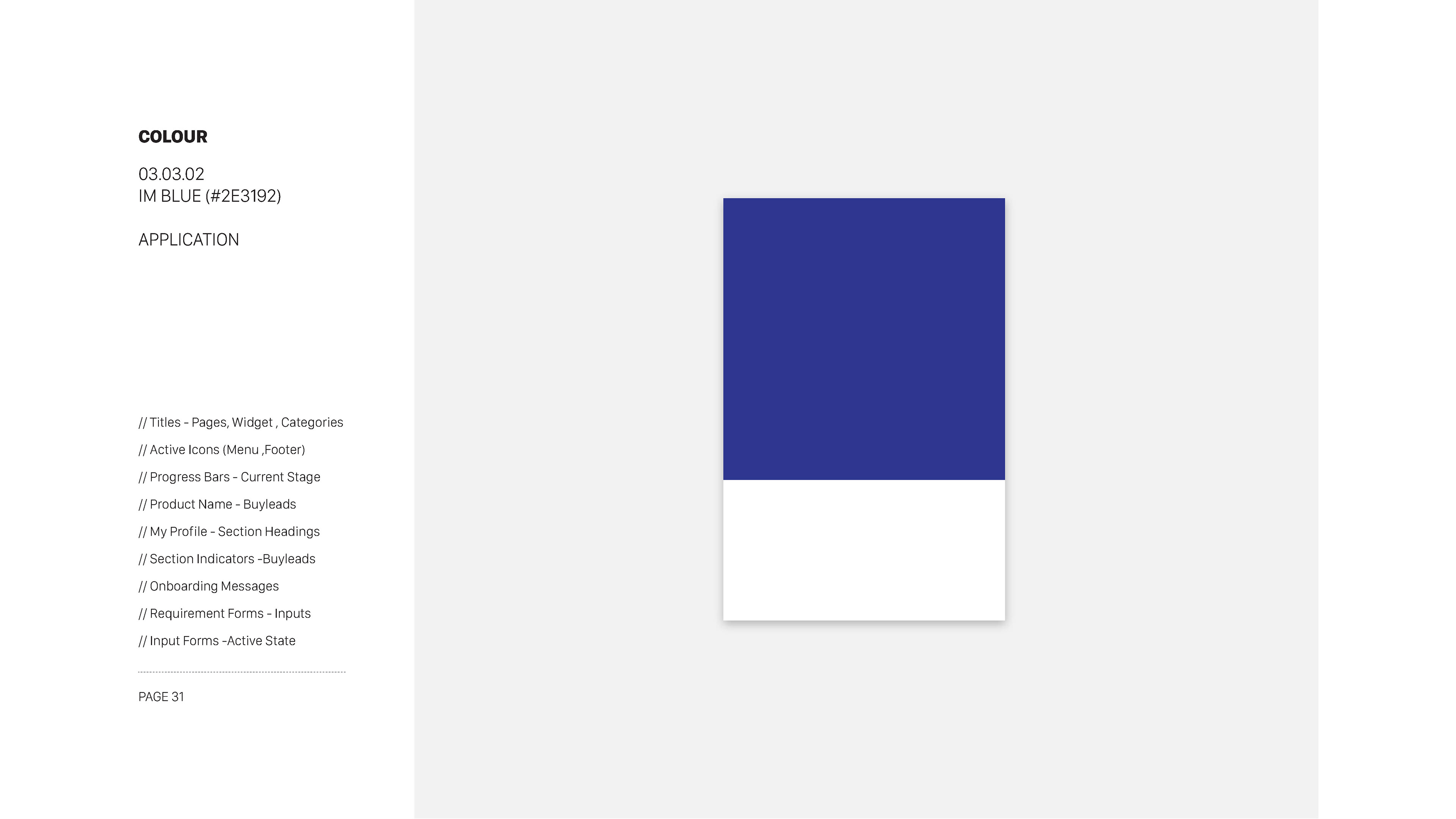
Days 11-15: Color Palette and Branding
The design principles included clarity, consistency, responsiveness, and accessibility, ensuring that our design philosophy aligned with our client's objectives.
Days 11-15: Color Palette and Branding
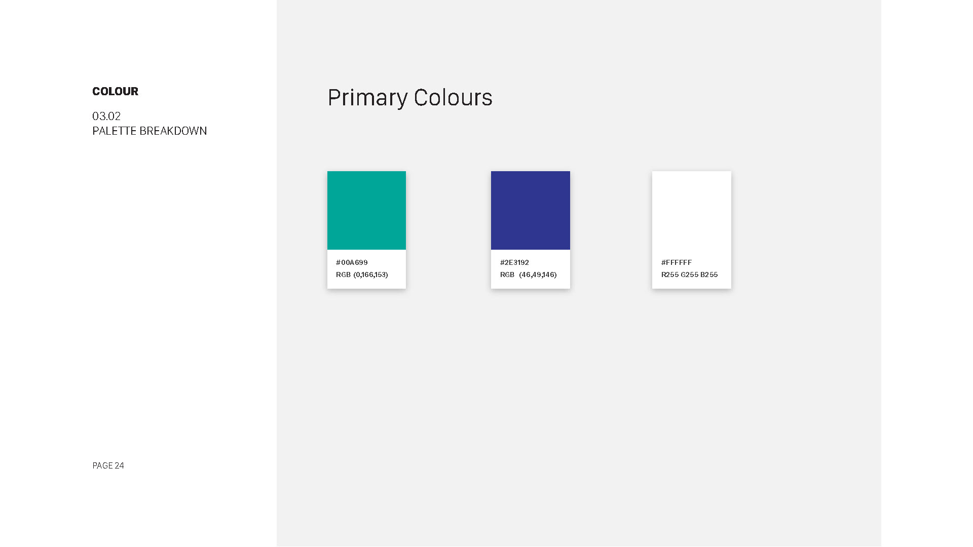
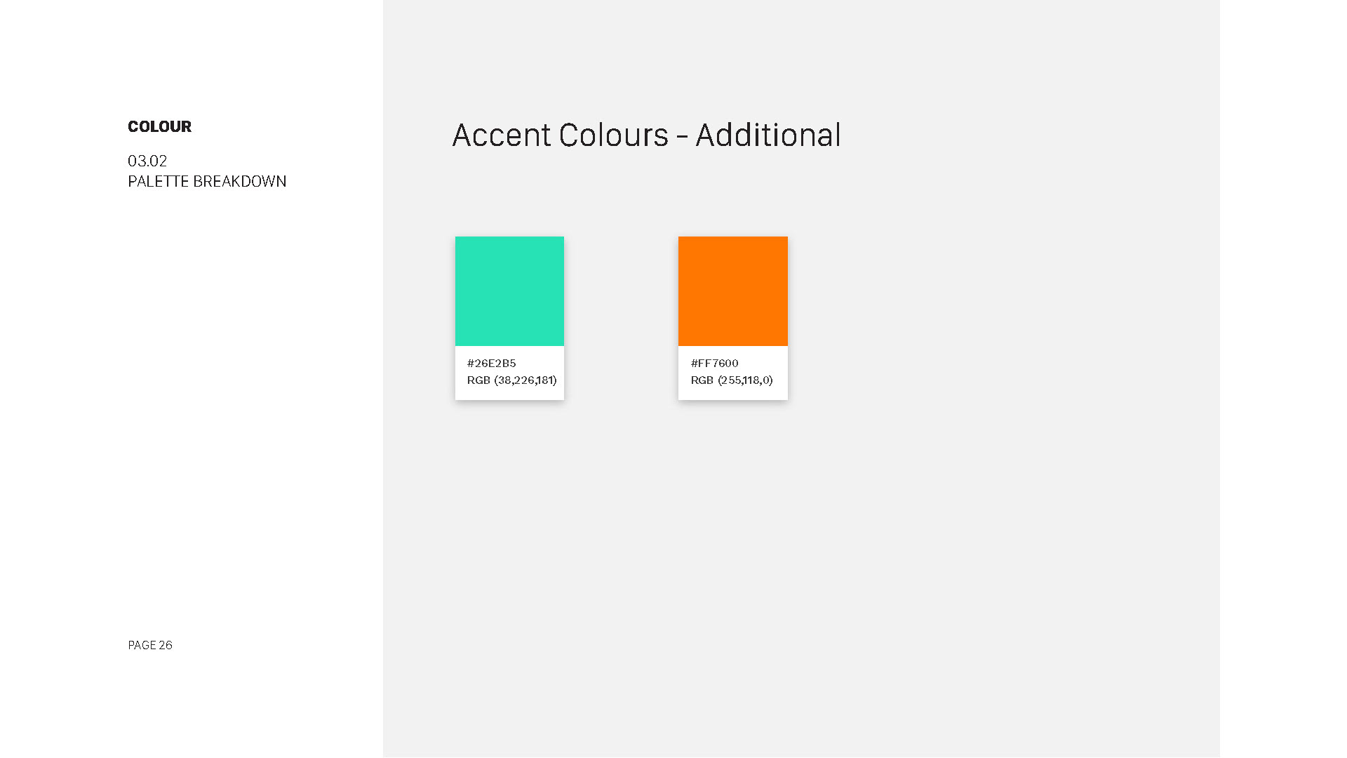
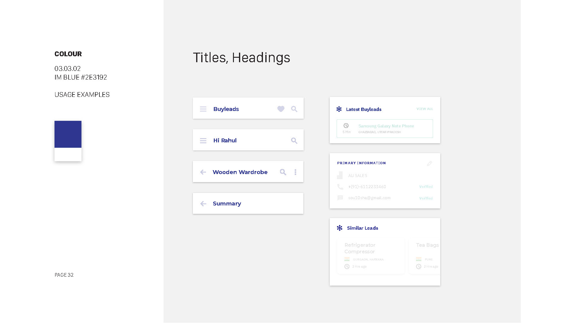
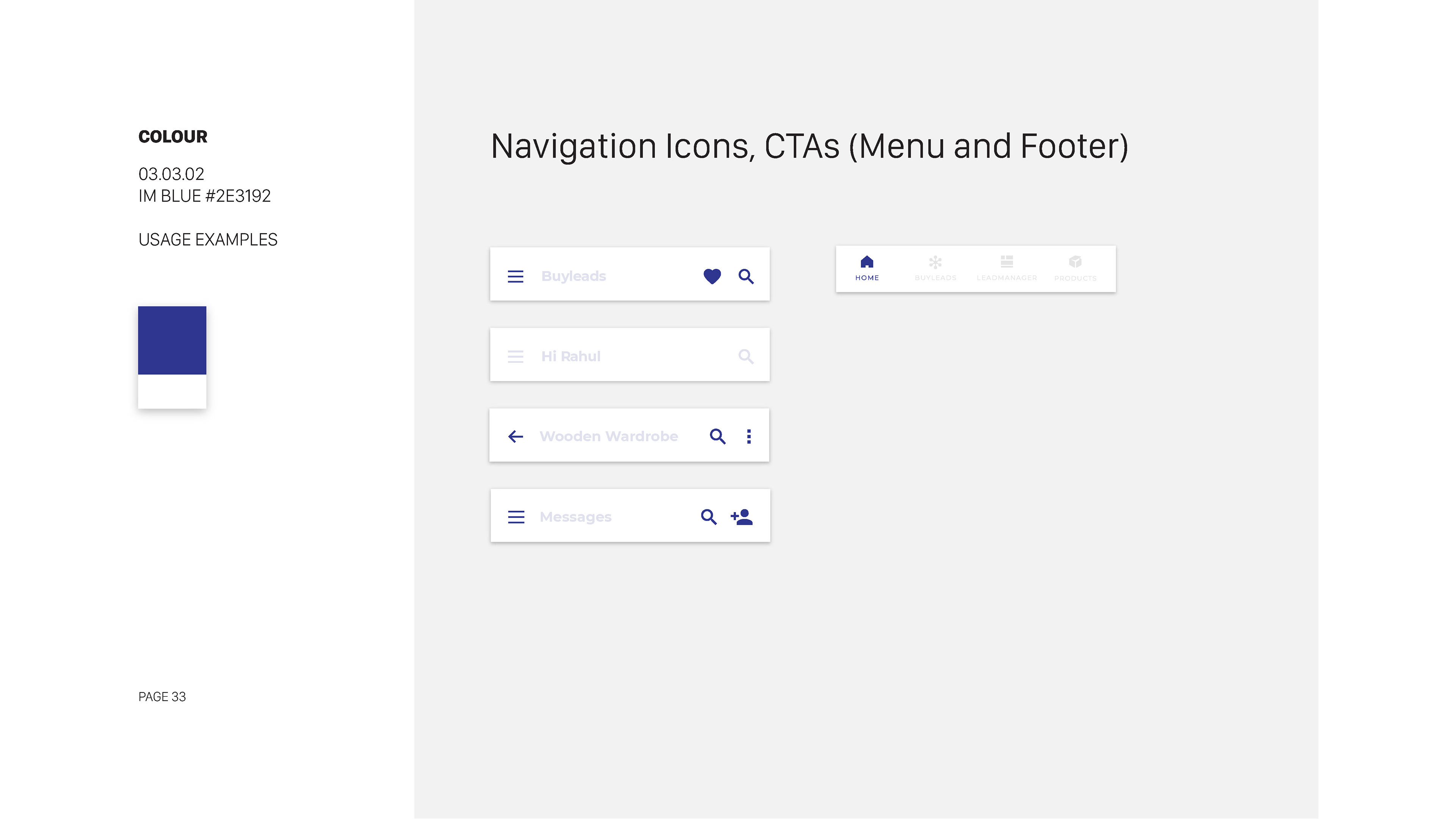
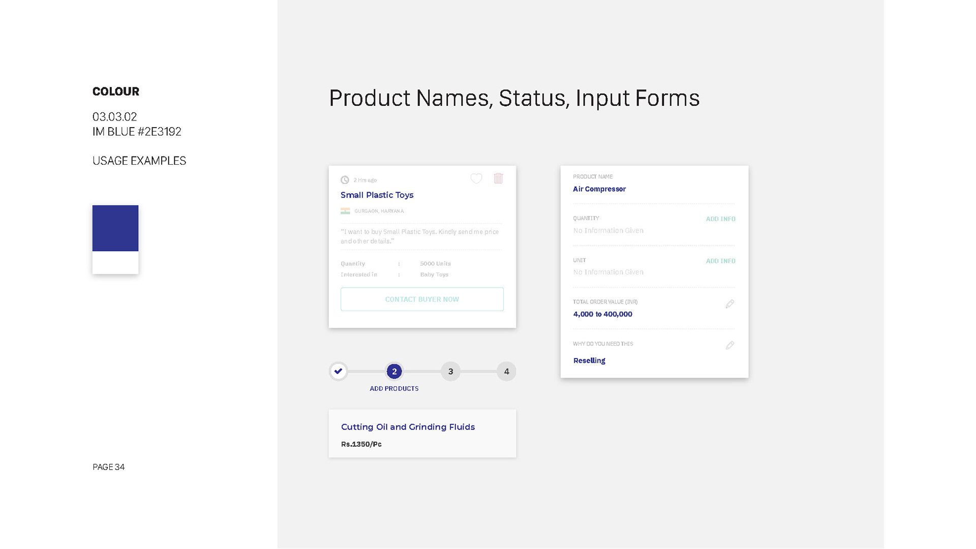
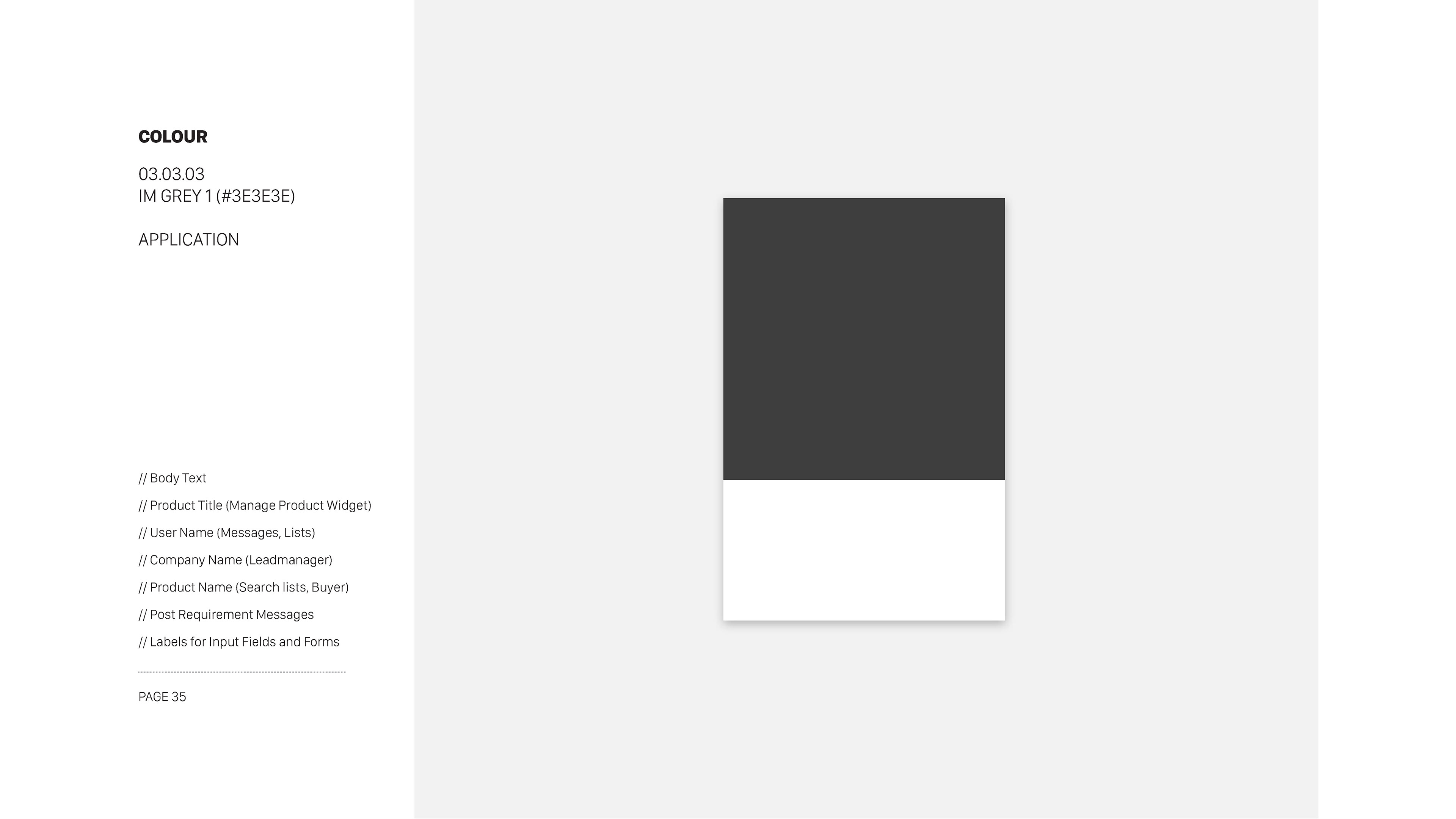
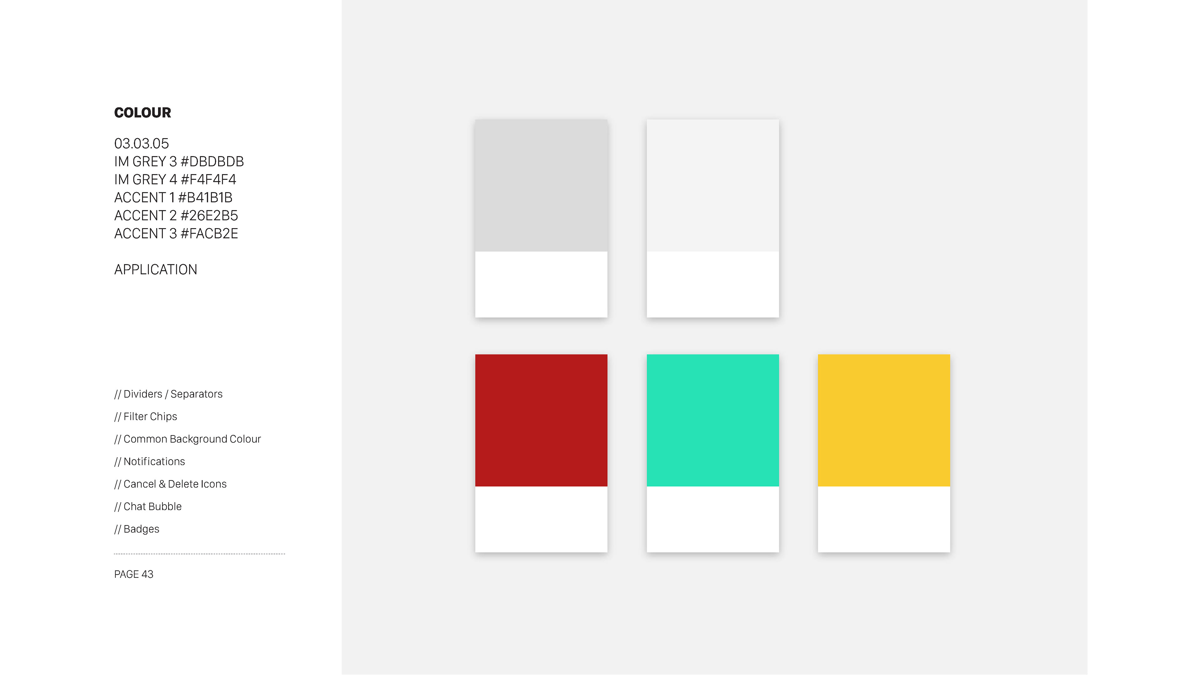
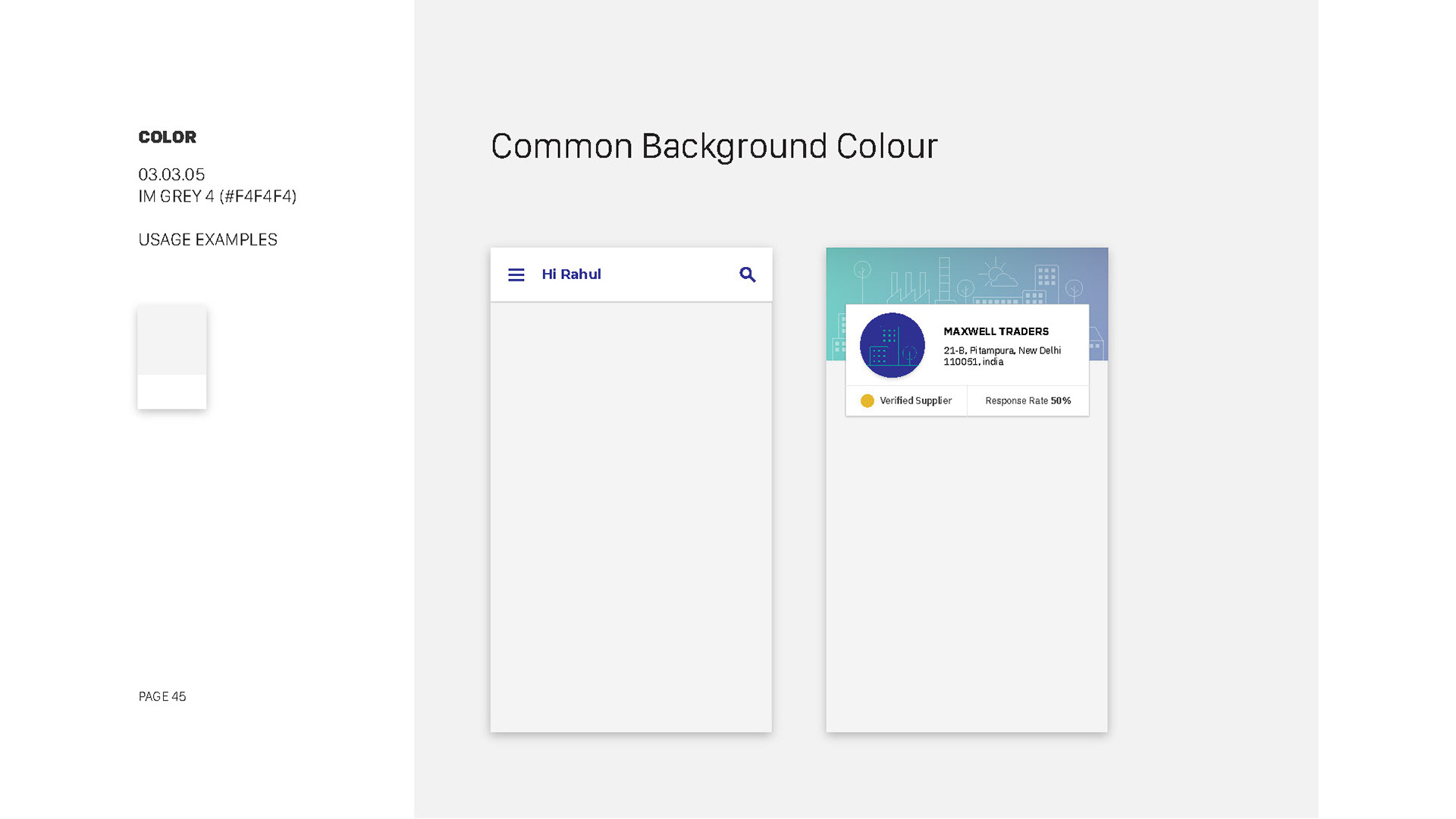
After thorough brand analysis, we selected a primary color palette of #007BFF (blue) and #333333 (gray) to reflect the brand's trustworthiness and professionalism.
Documented color codes, usage guidelines, and provided accessibility data, ensuring that color choices met WCAG AA standards.
Days 16-20: Typography and Font Selection
Documented color codes, usage guidelines, and provided accessibility data, ensuring that color choices met WCAG AA standards.
Days 16-20: Typography and Font Selection
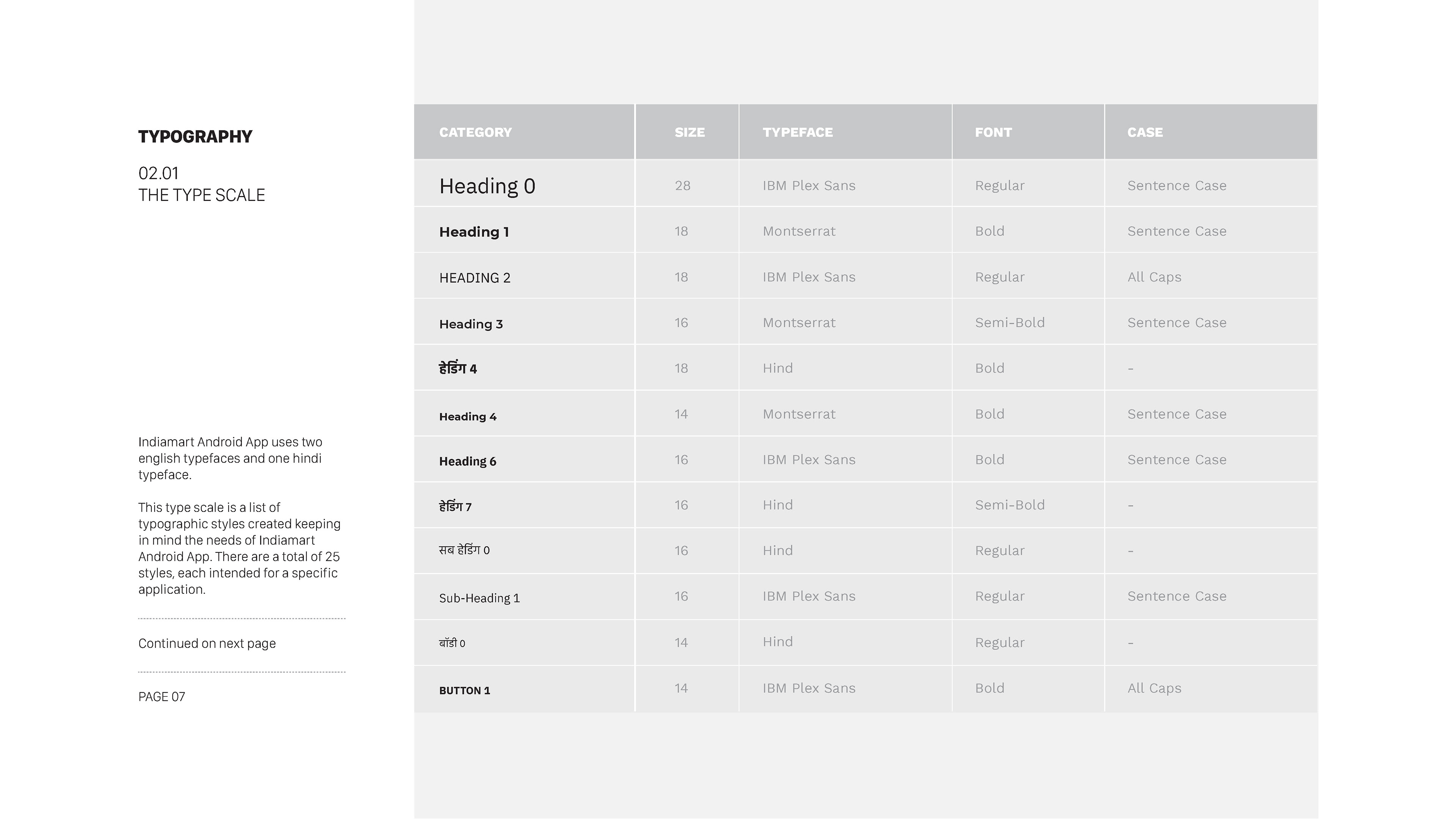
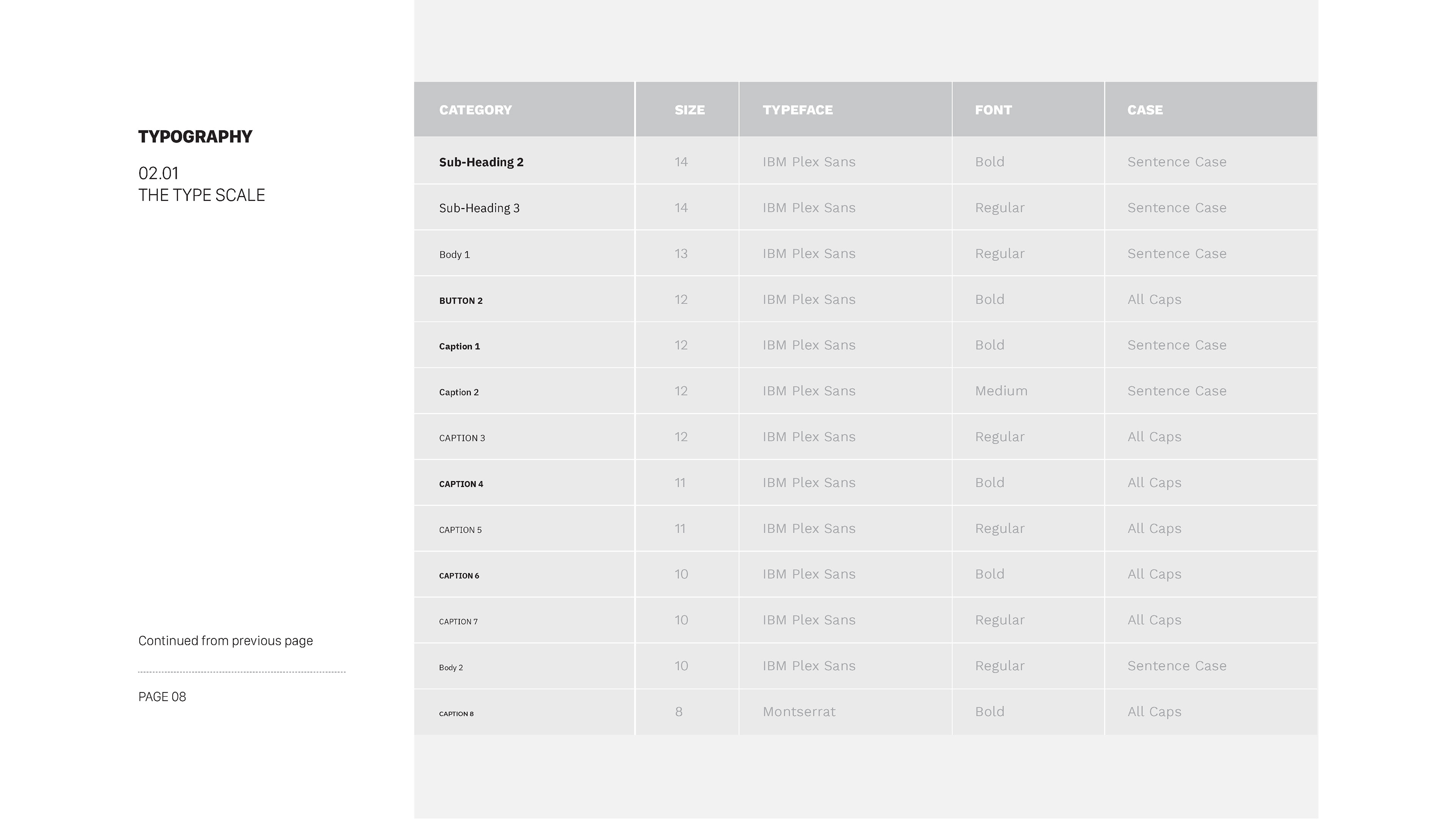
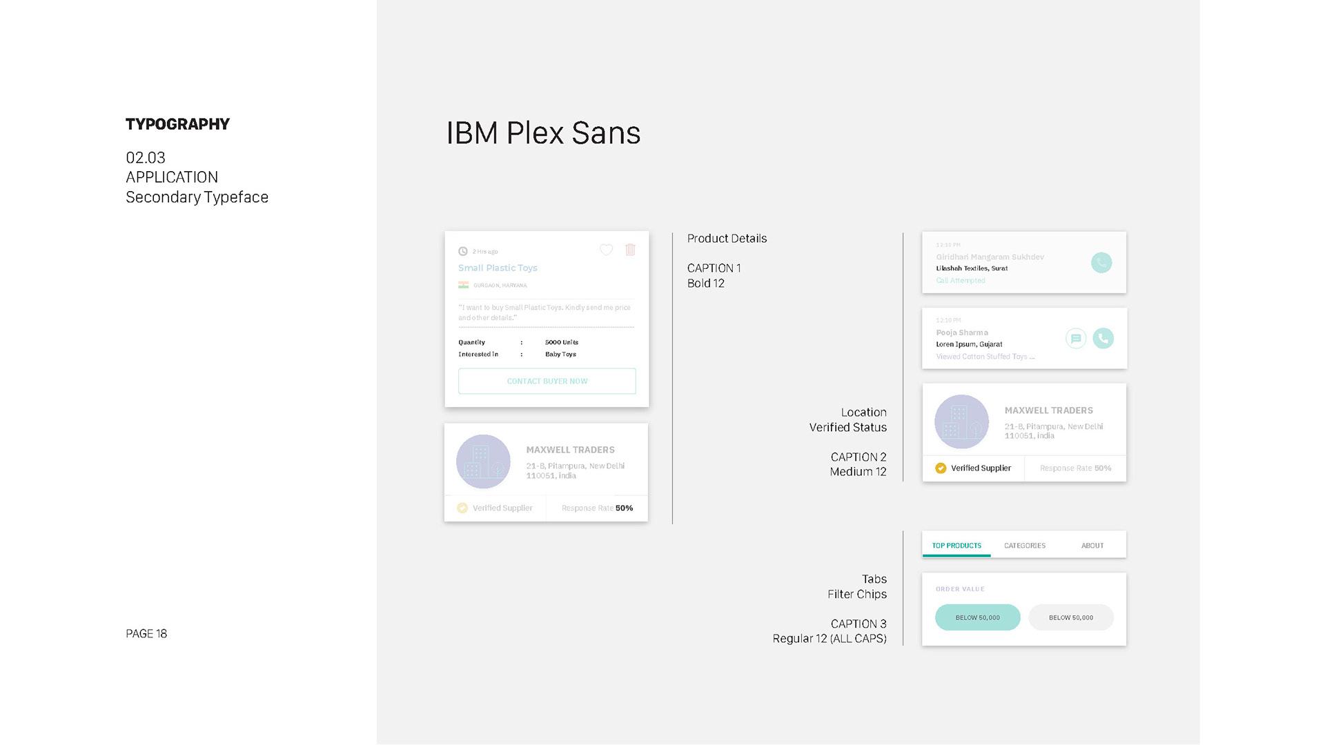
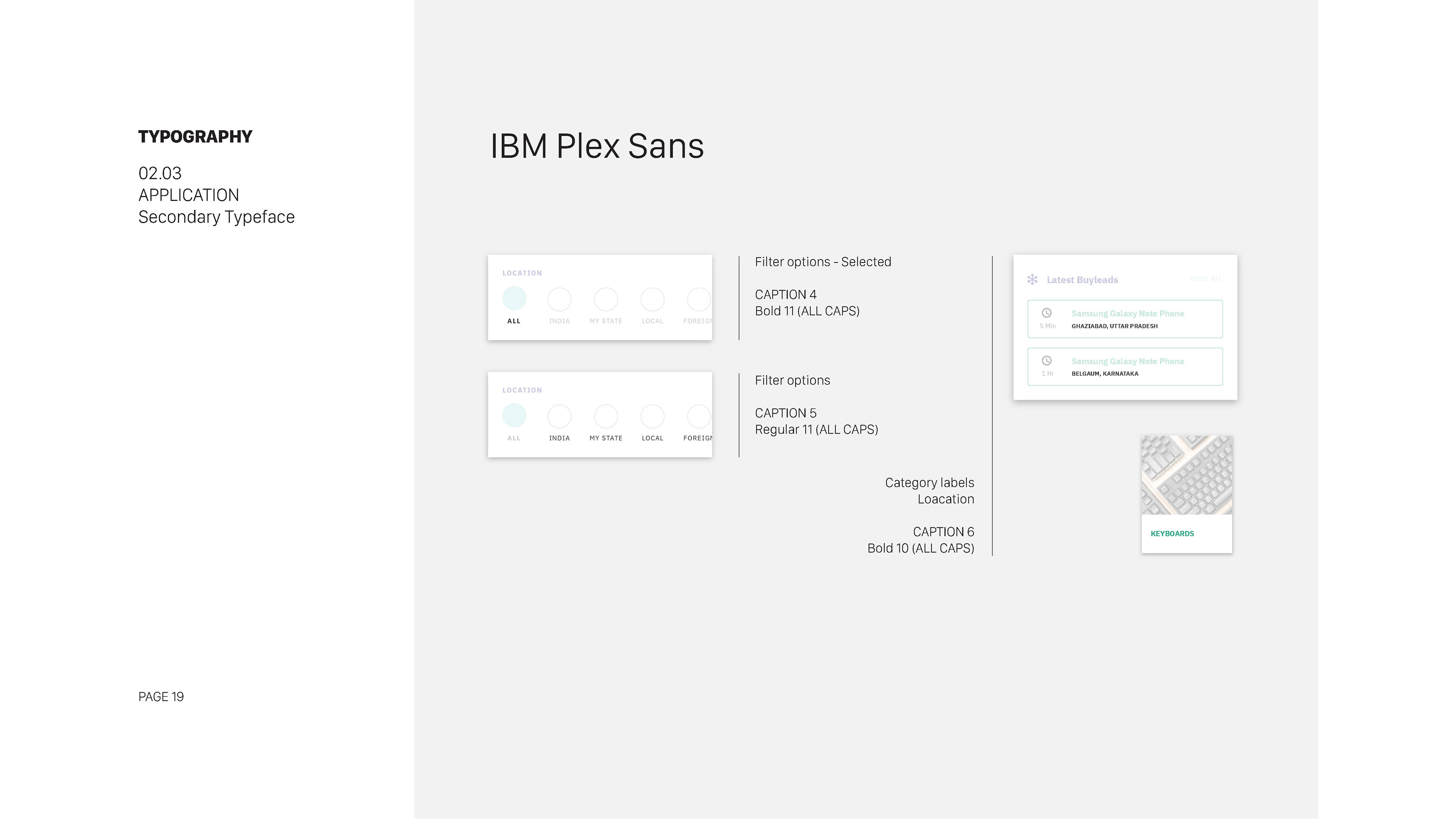
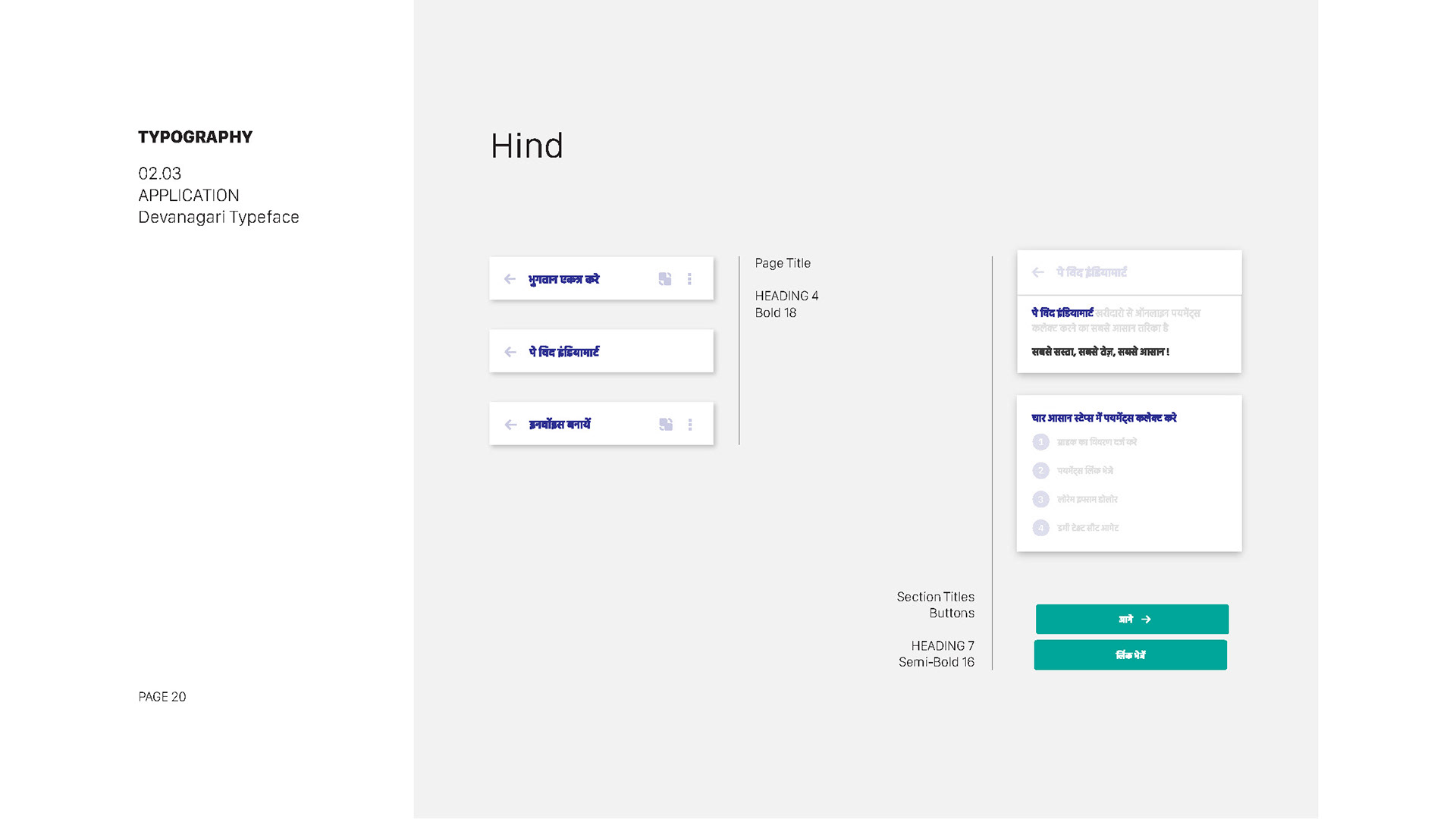
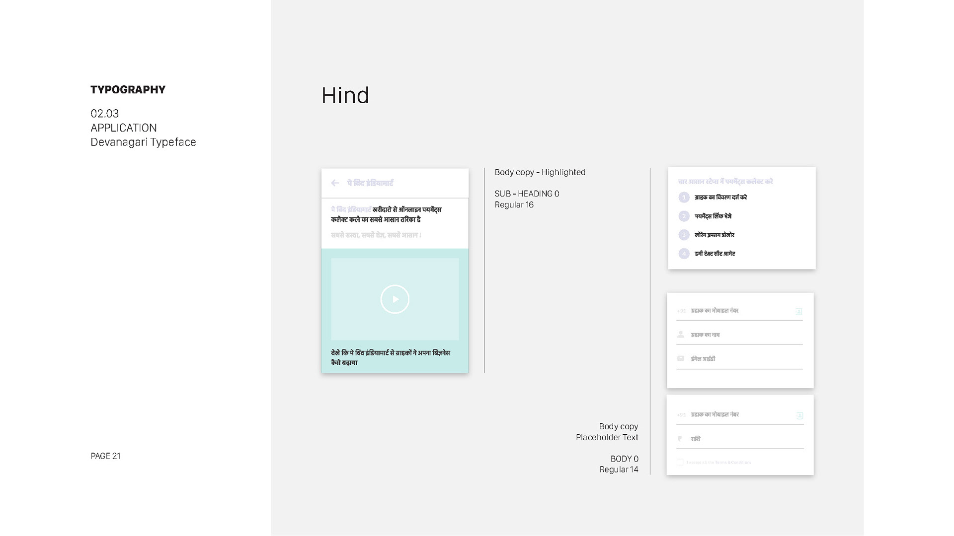
Chose "Roboto" as the primary typeface for its readability and versatility, and "Raleway" as a complementary font for headings.
Established font sizes, line heights, and spacing, adhering to typography best practices and accessibility requirements.
Days 21-25: Iconography
Established font sizes, line heights, and spacing, adhering to typography best practices and accessibility requirements.
Days 21-25: Iconography
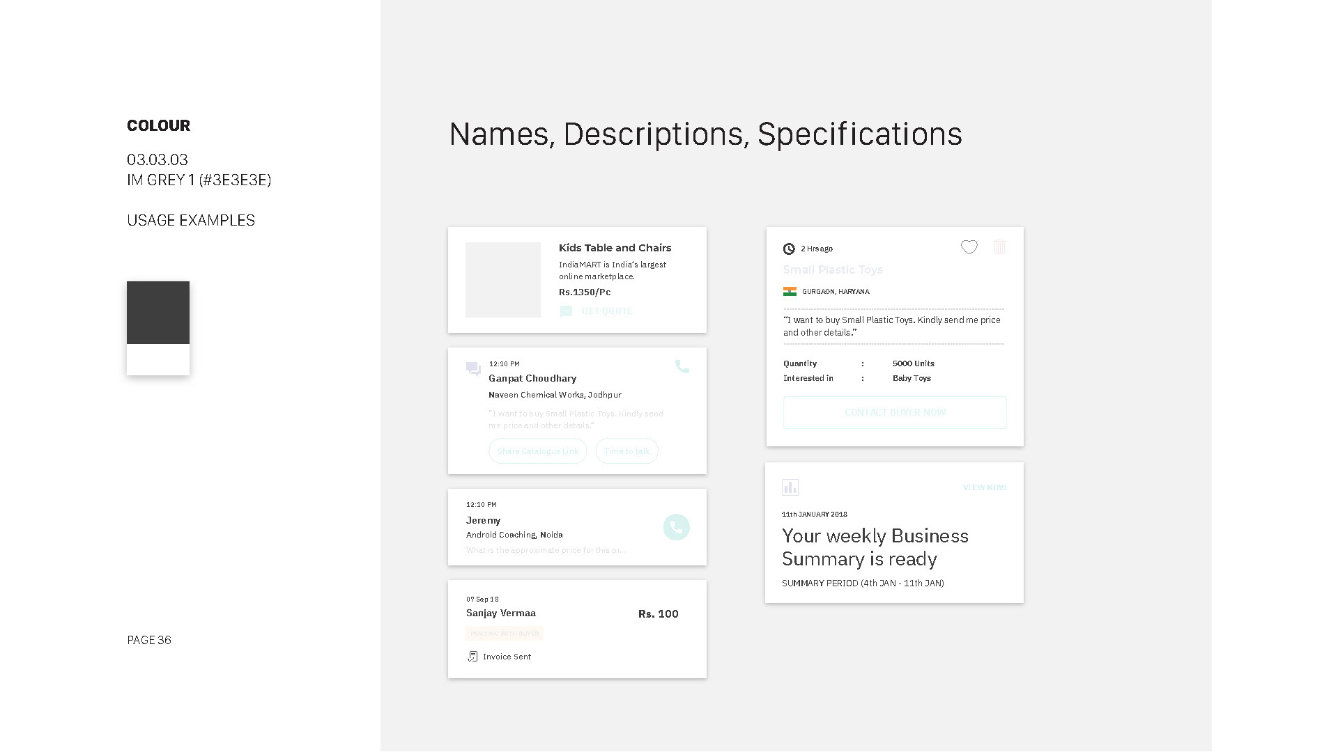
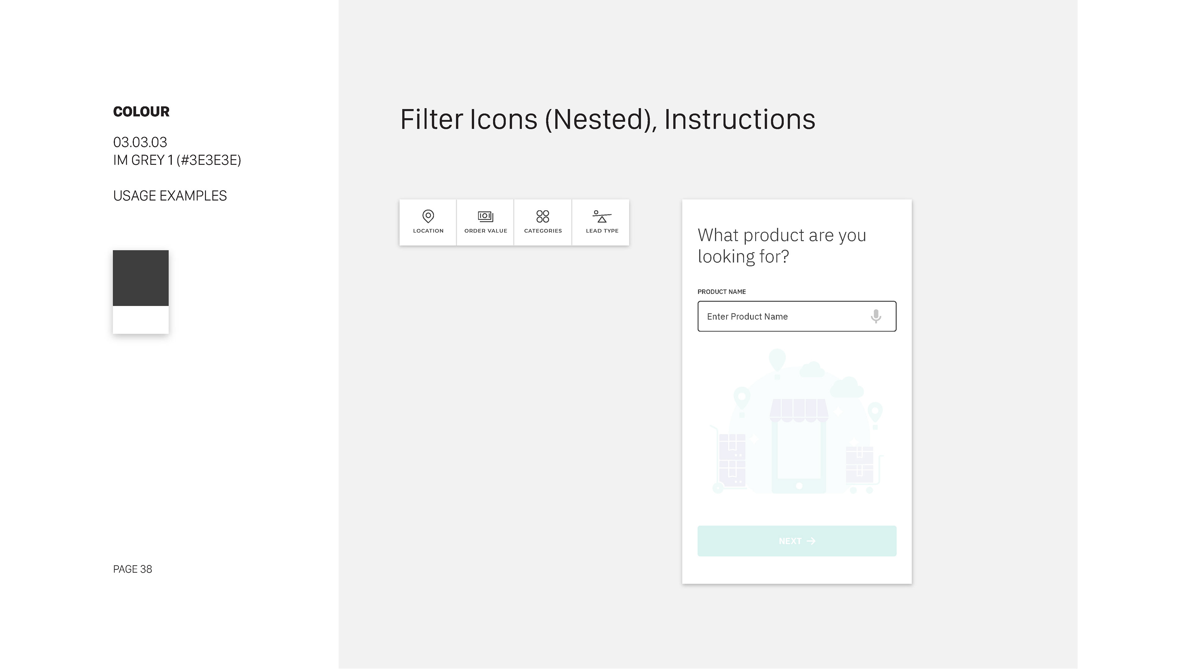
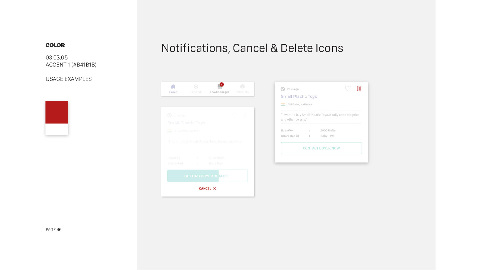
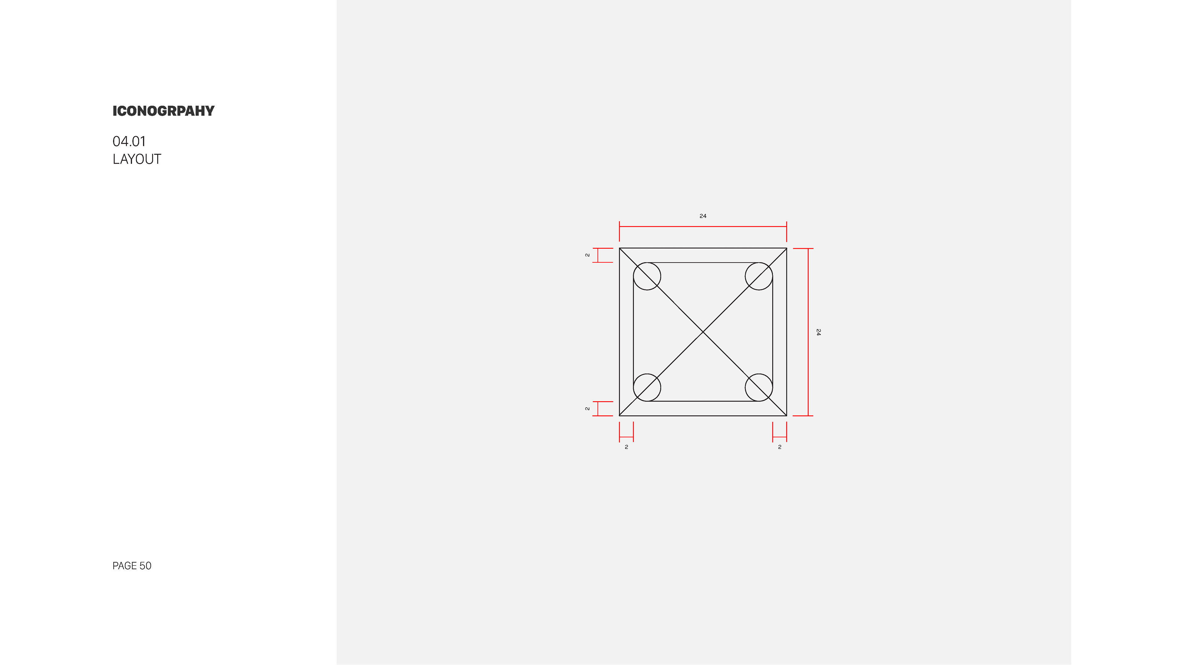
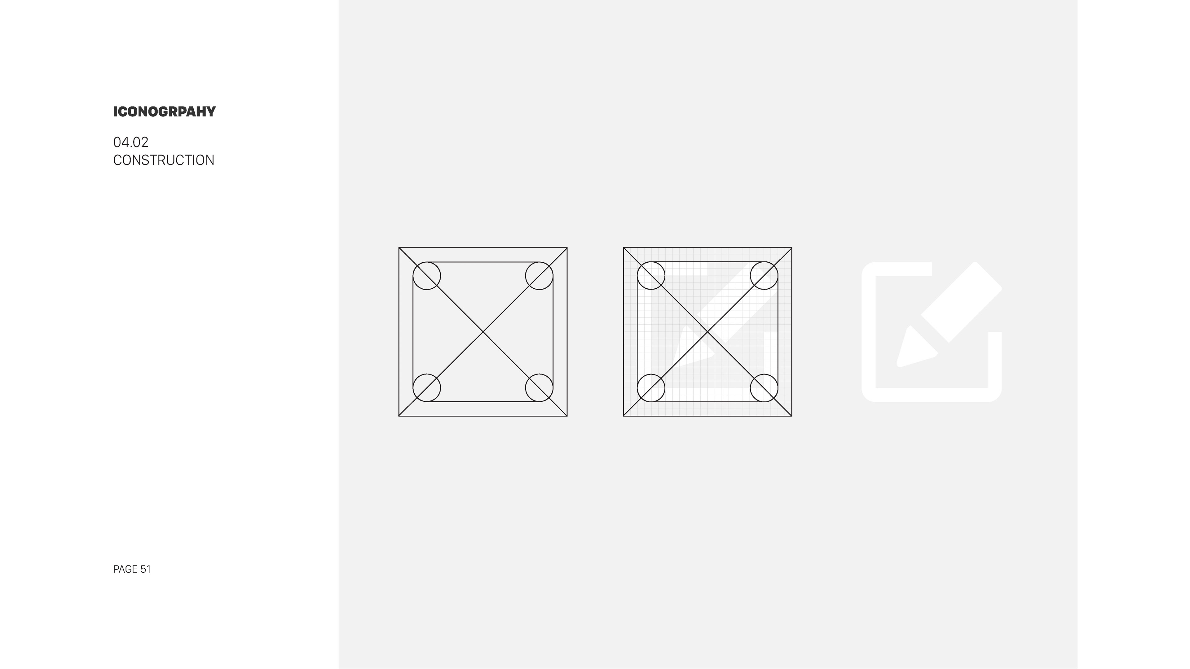
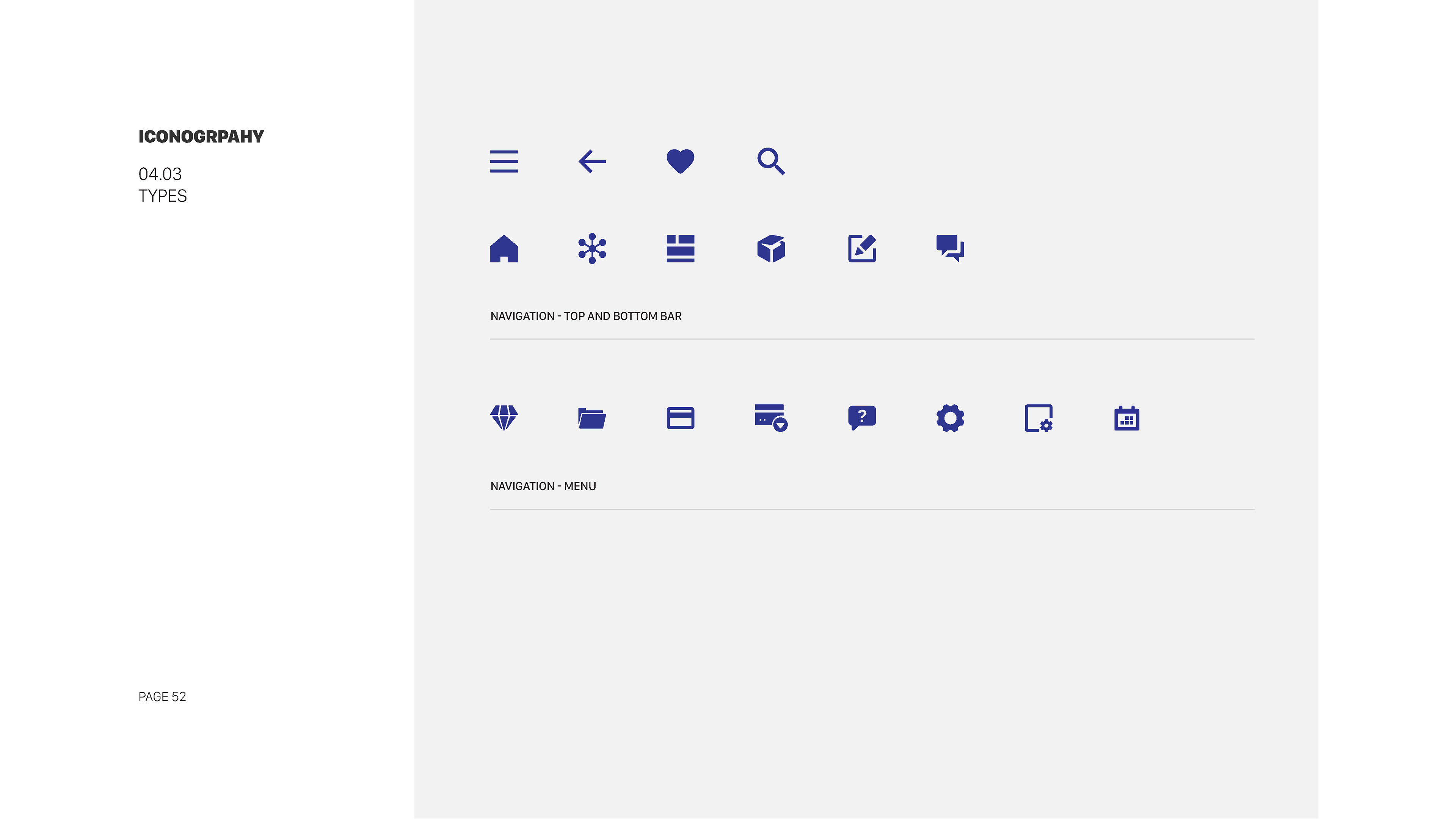
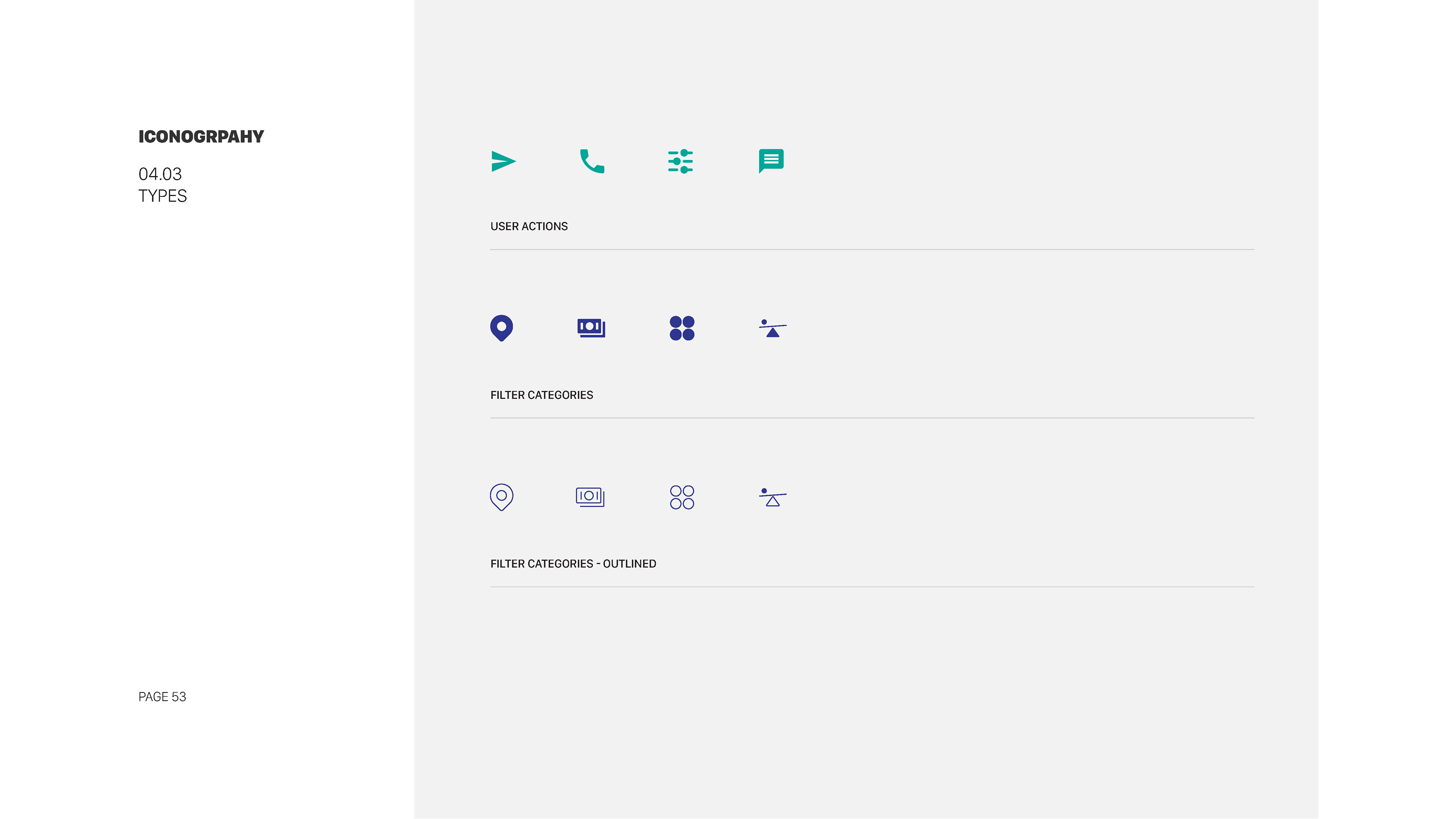
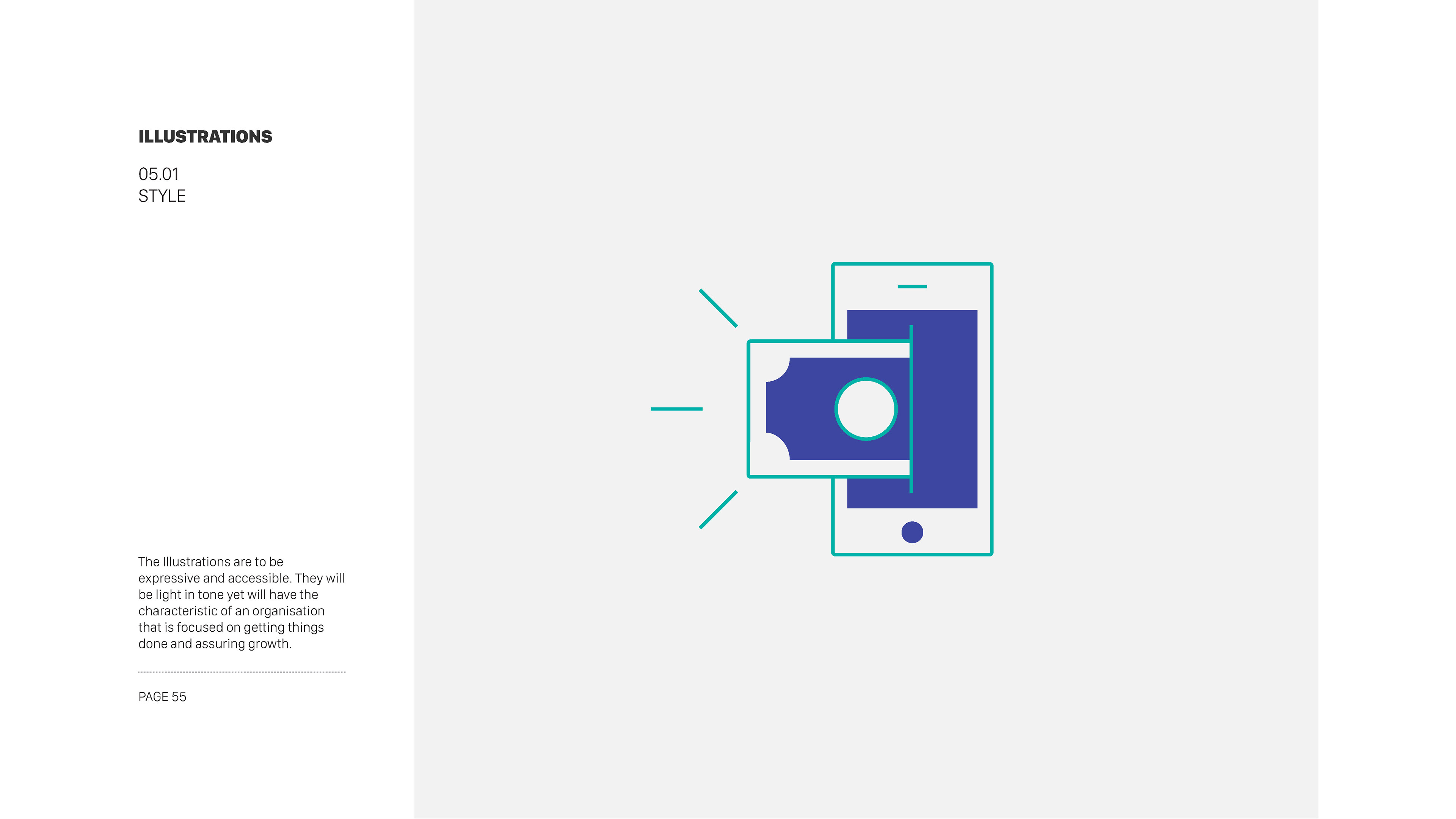
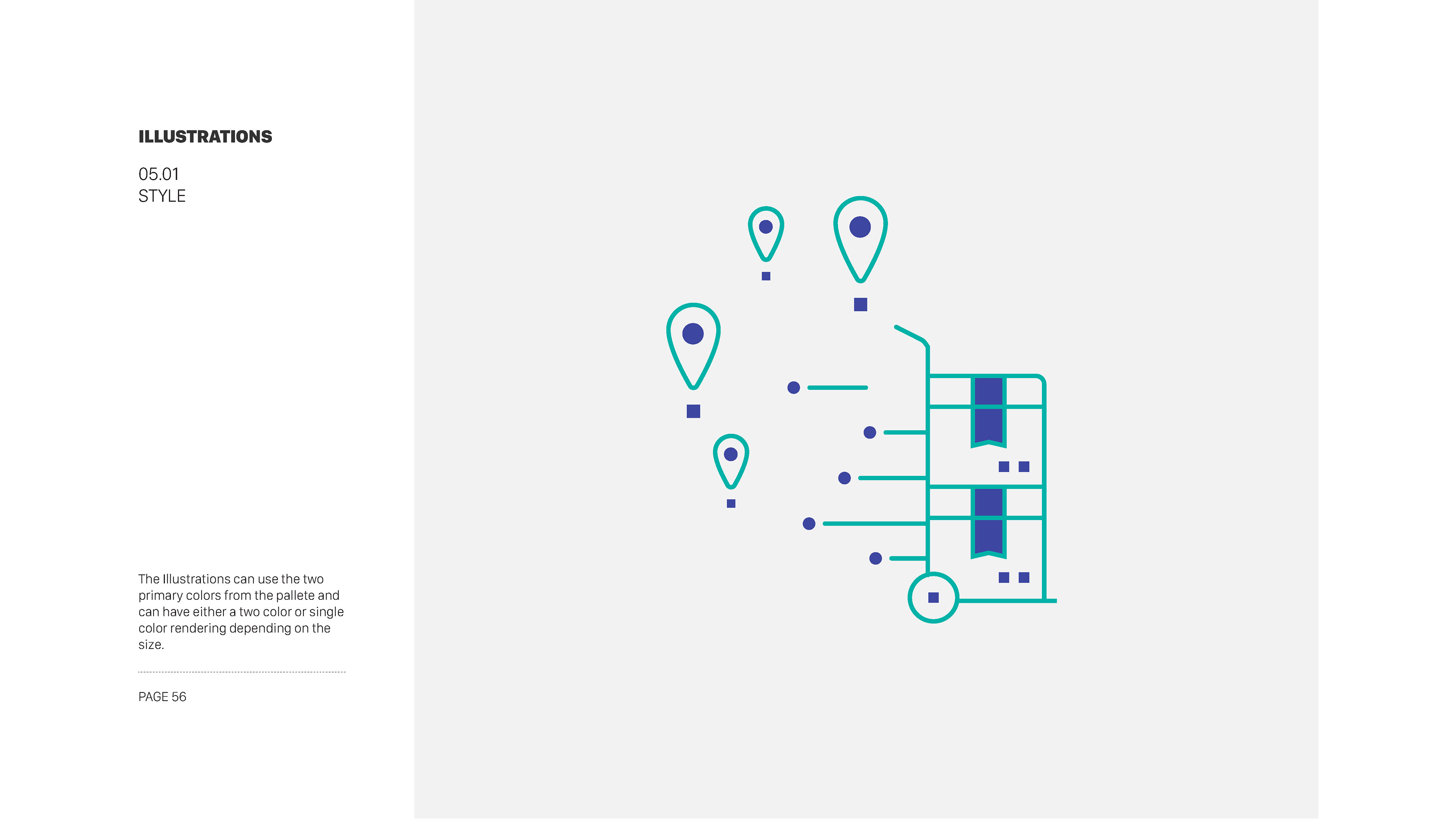
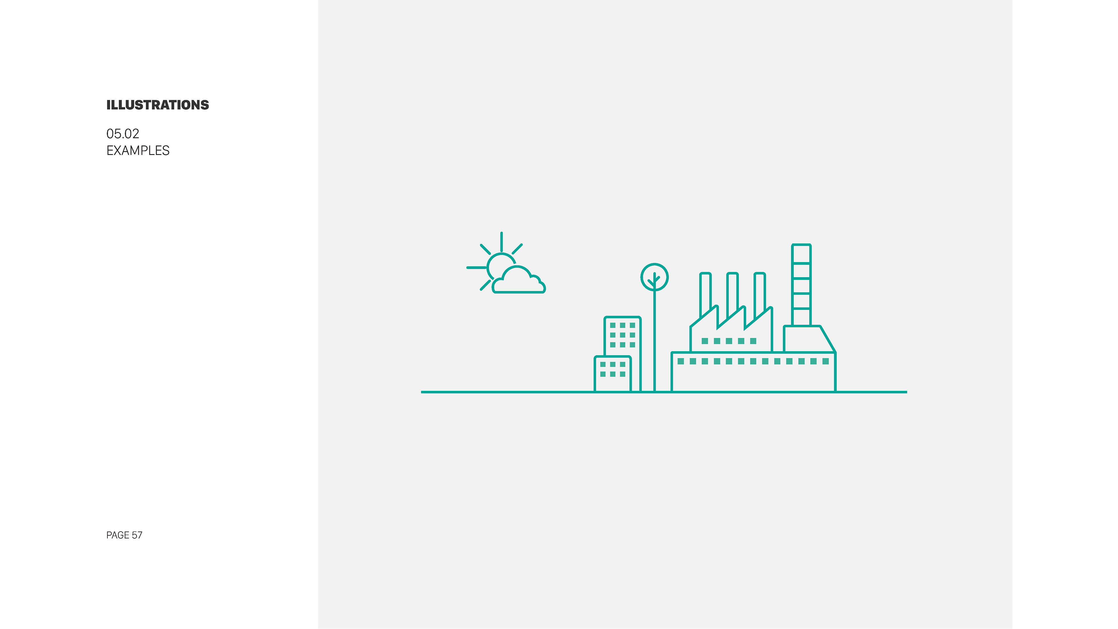
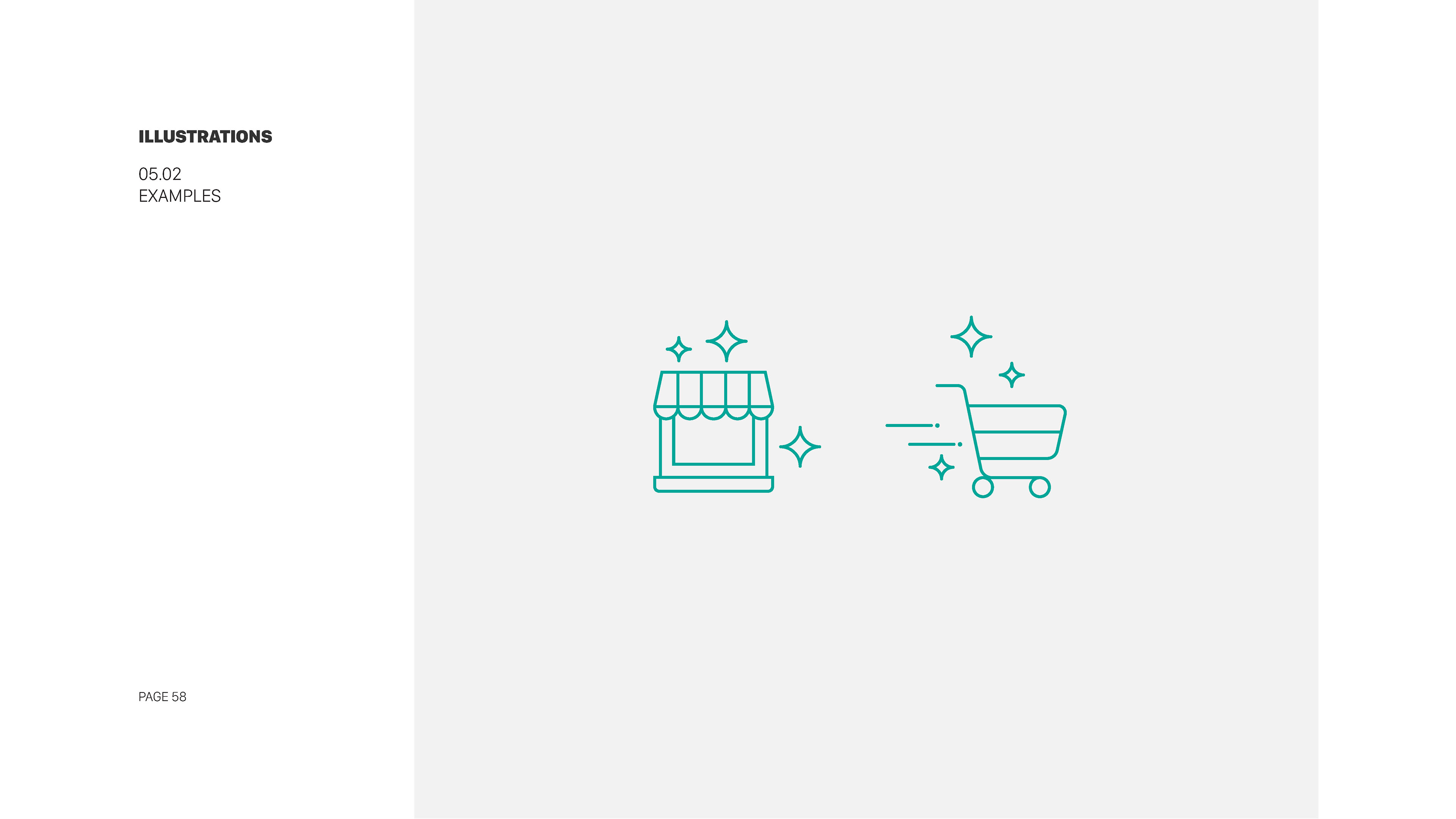
Developed a customized icon set in SVG format, covering essential actions and UI elements.
We created three icon sizes (16x16, 24x24, and 32x32 pixels) to cater to various screen resolutions.
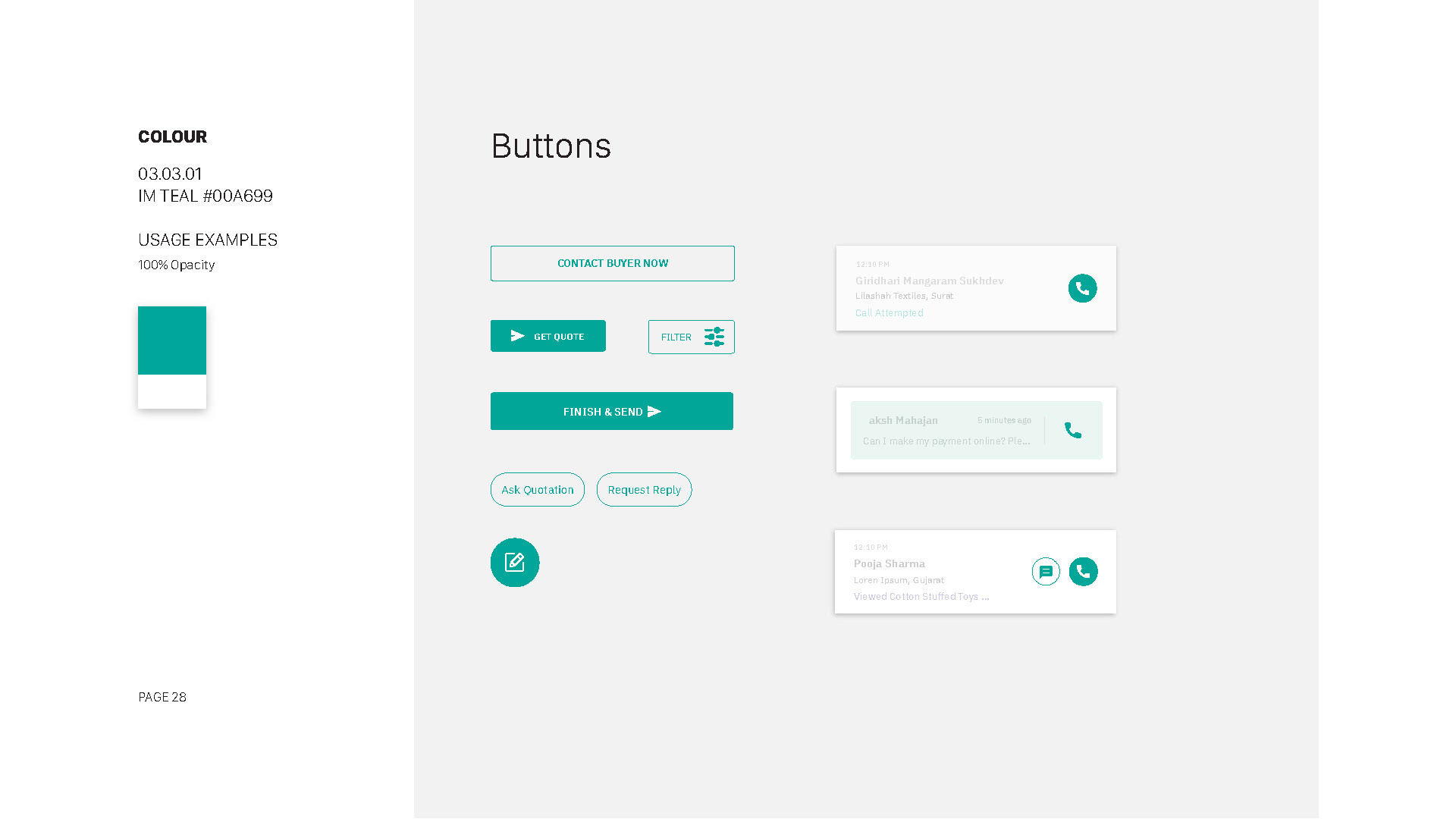
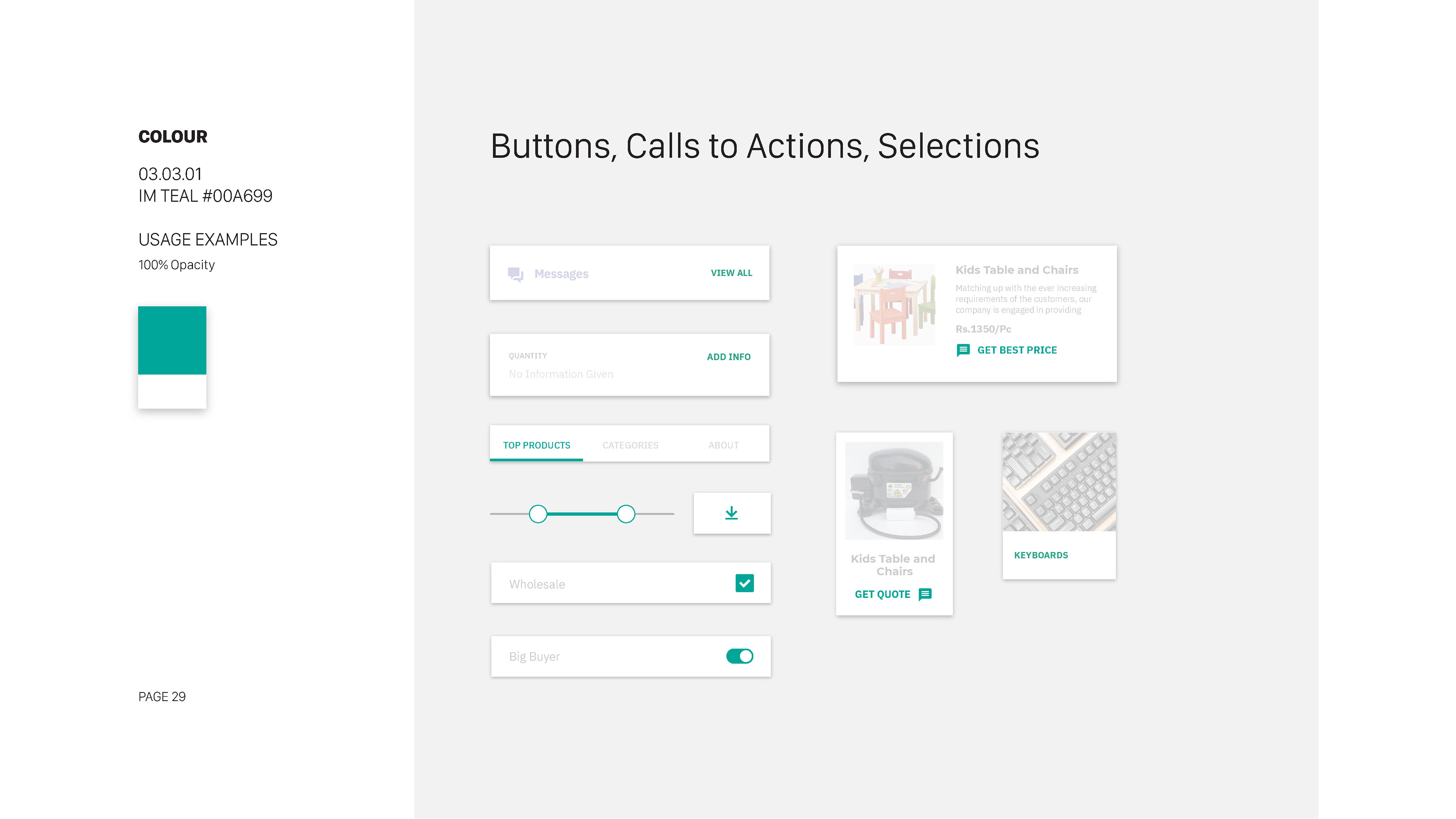
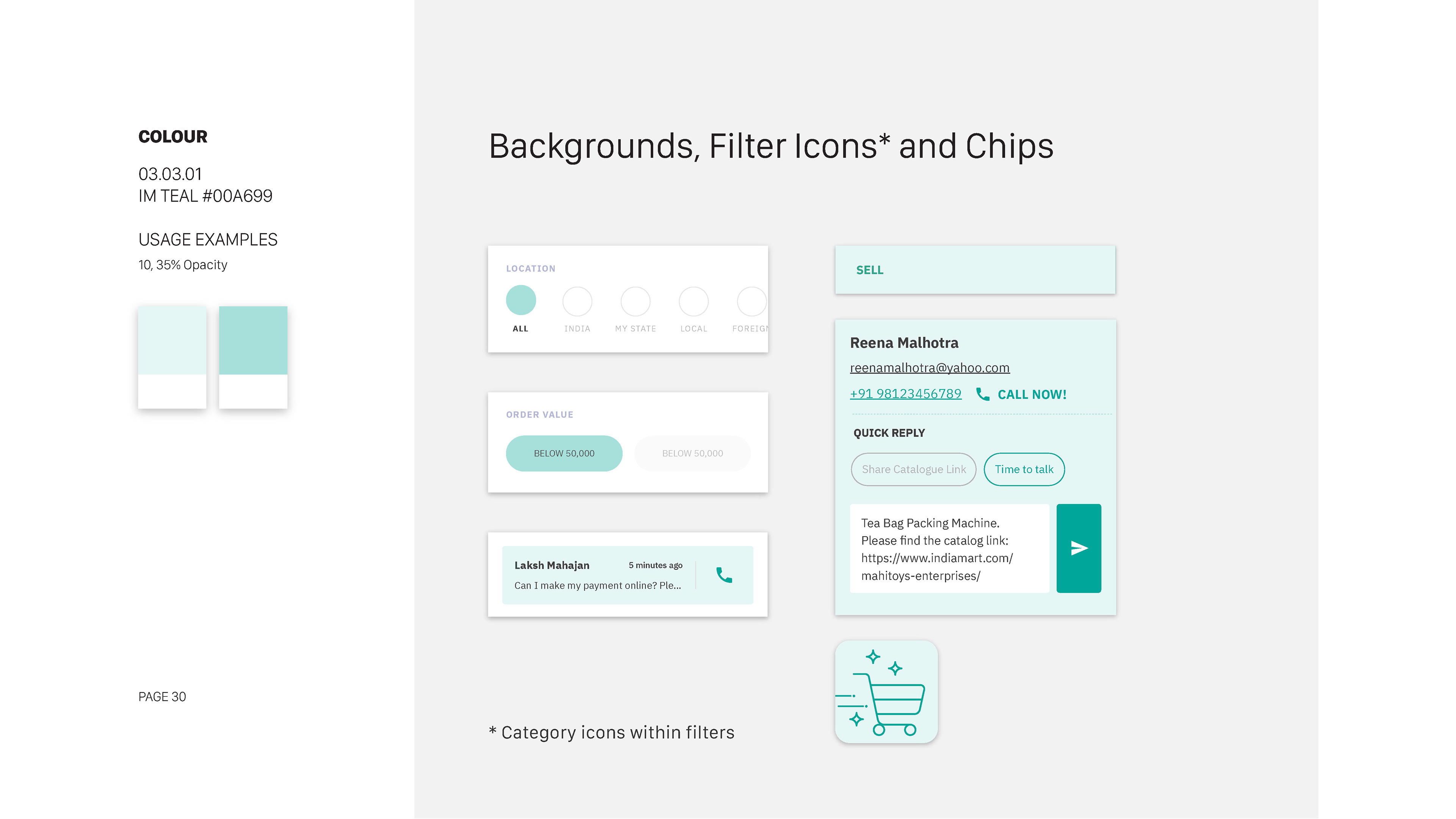
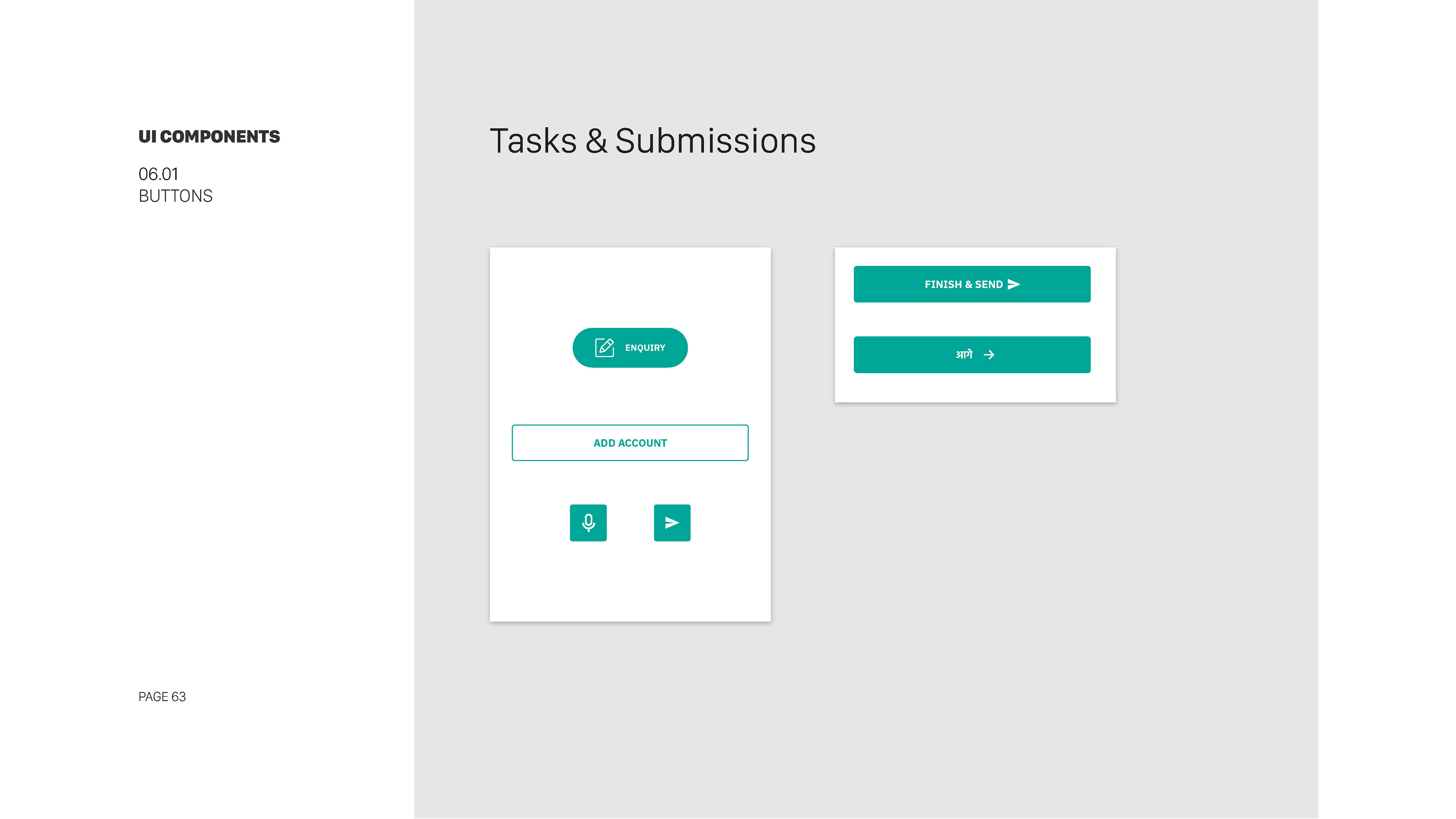
Days 26-30: Buttons and Interactive Elements
We created three icon sizes (16x16, 24x24, and 32x32 pixels) to cater to various screen resolutions.
Days 26-30: Buttons and Interactive Elements
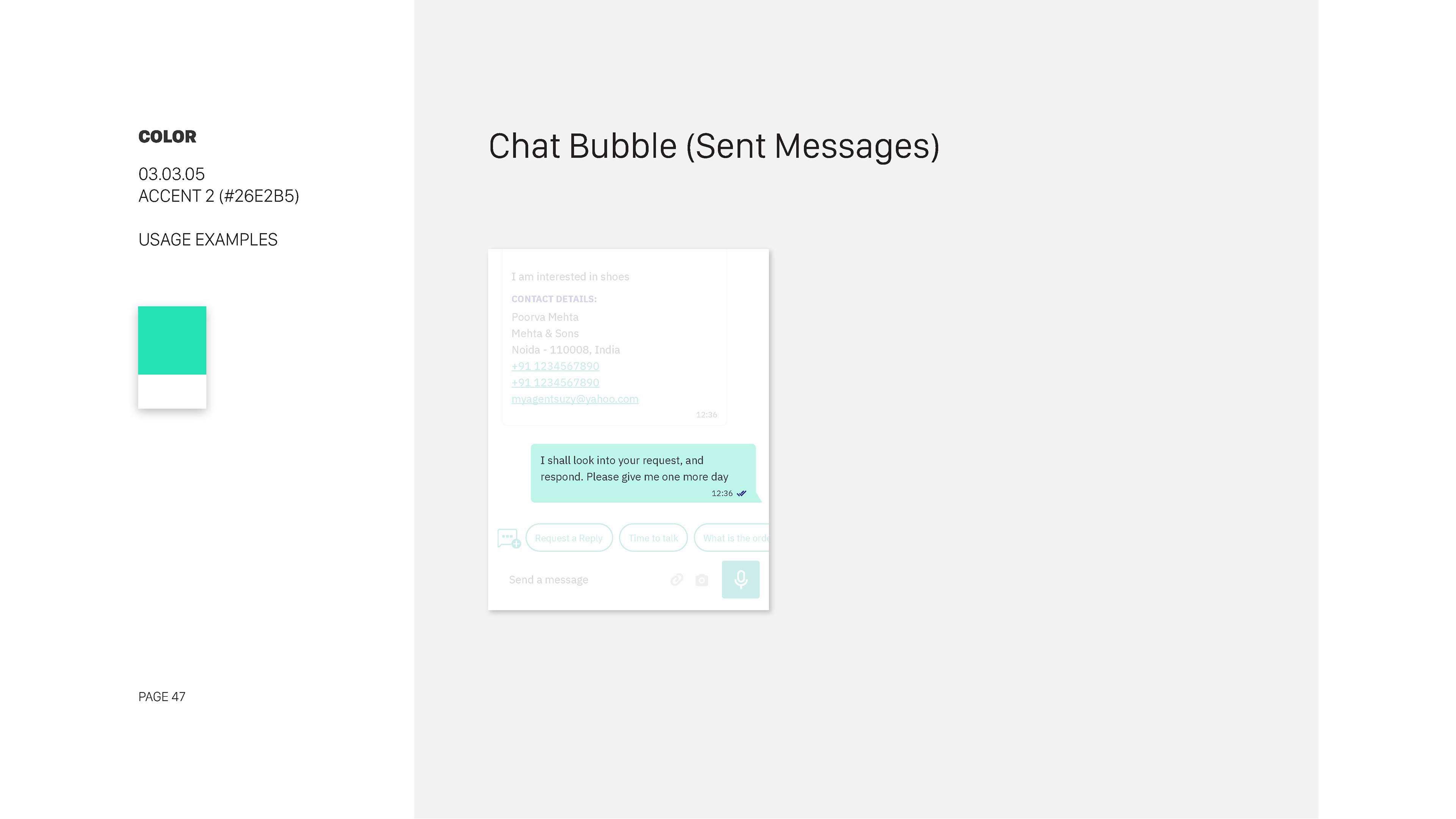
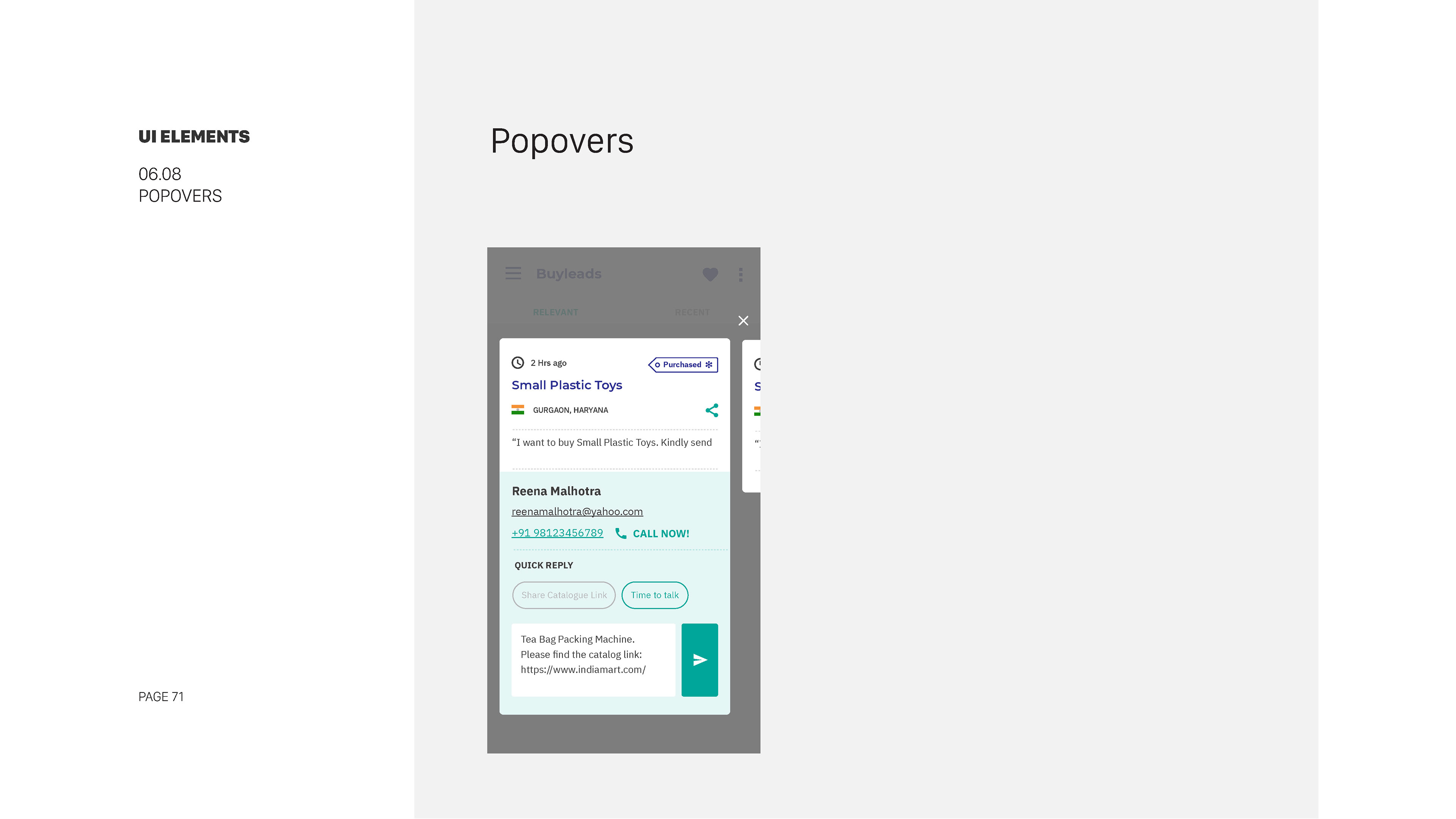
Designed visually distinct button styles, including a primary action button (#007BFF) and secondary buttons (#333333).
Defined button states with hover effects and active states, along with guidelines for interactions like click feedback.
Days 31-35: Forms and Input Fields
Defined button states with hover effects and active states, along with guidelines for interactions like click feedback.
Days 31-35: Forms and Input Fields
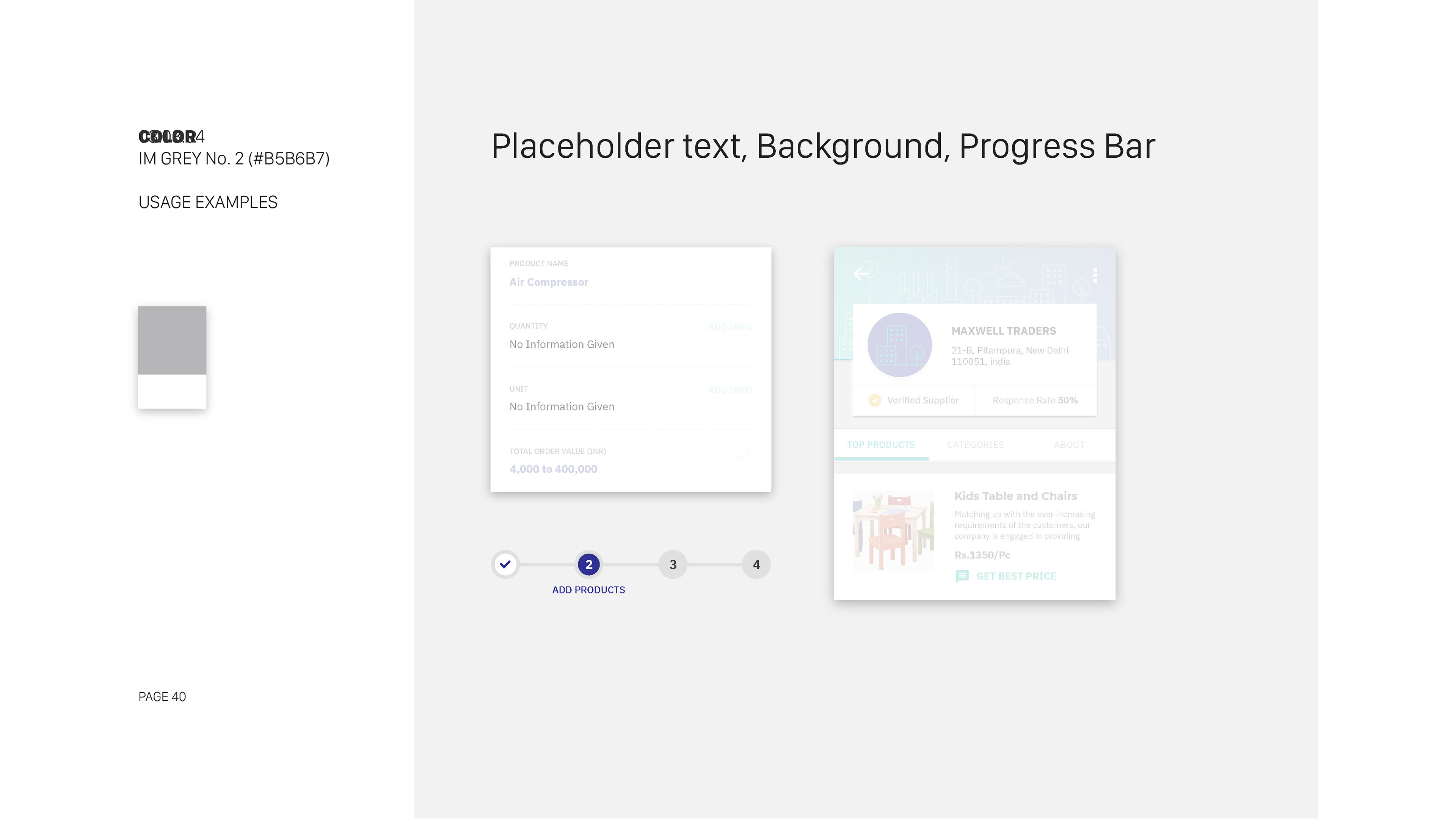
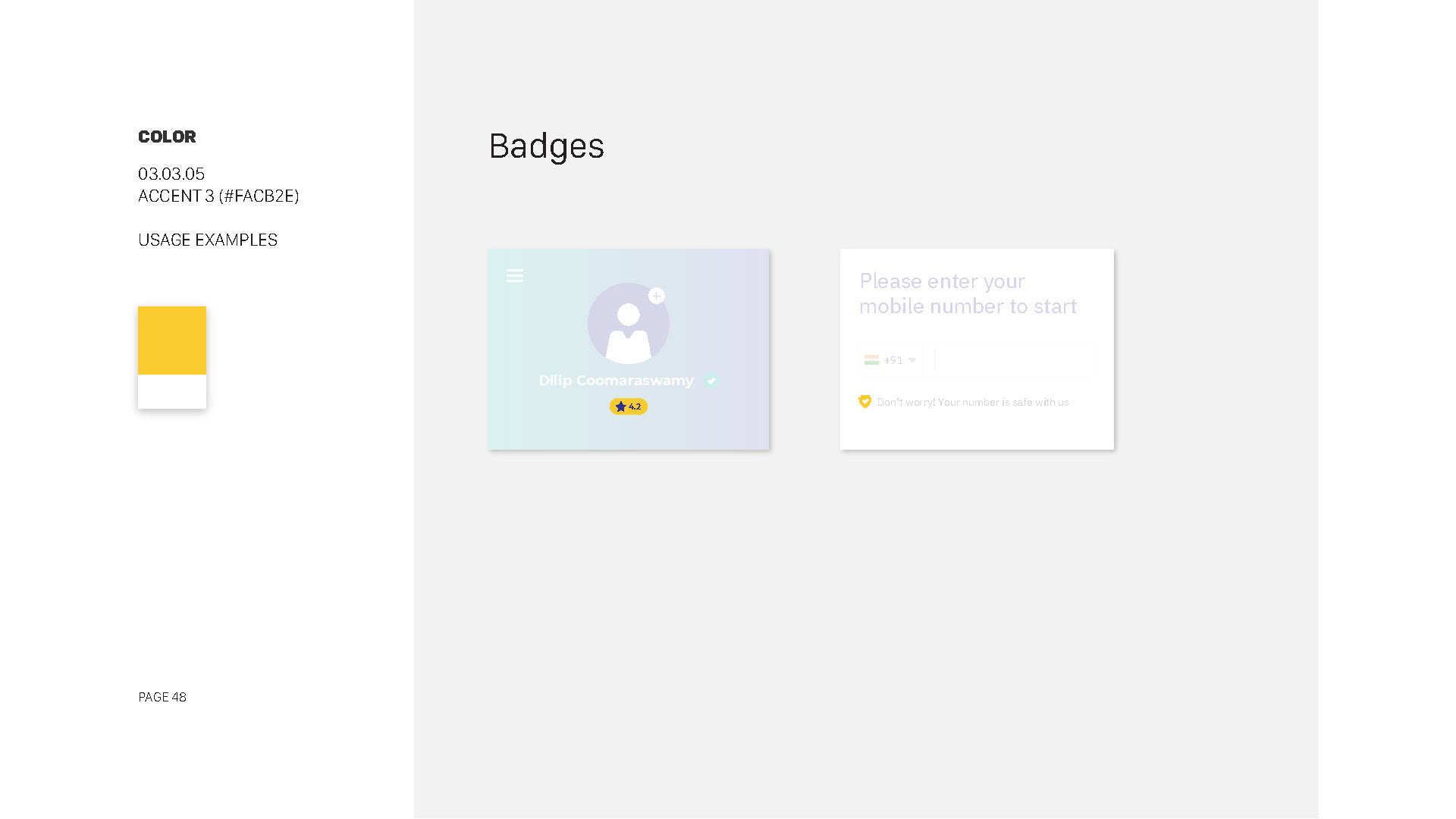
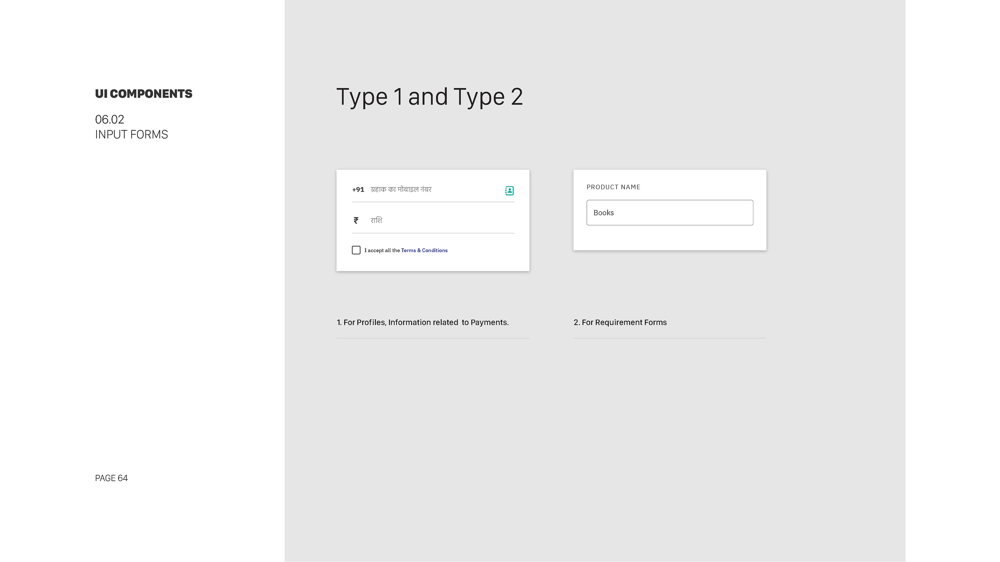
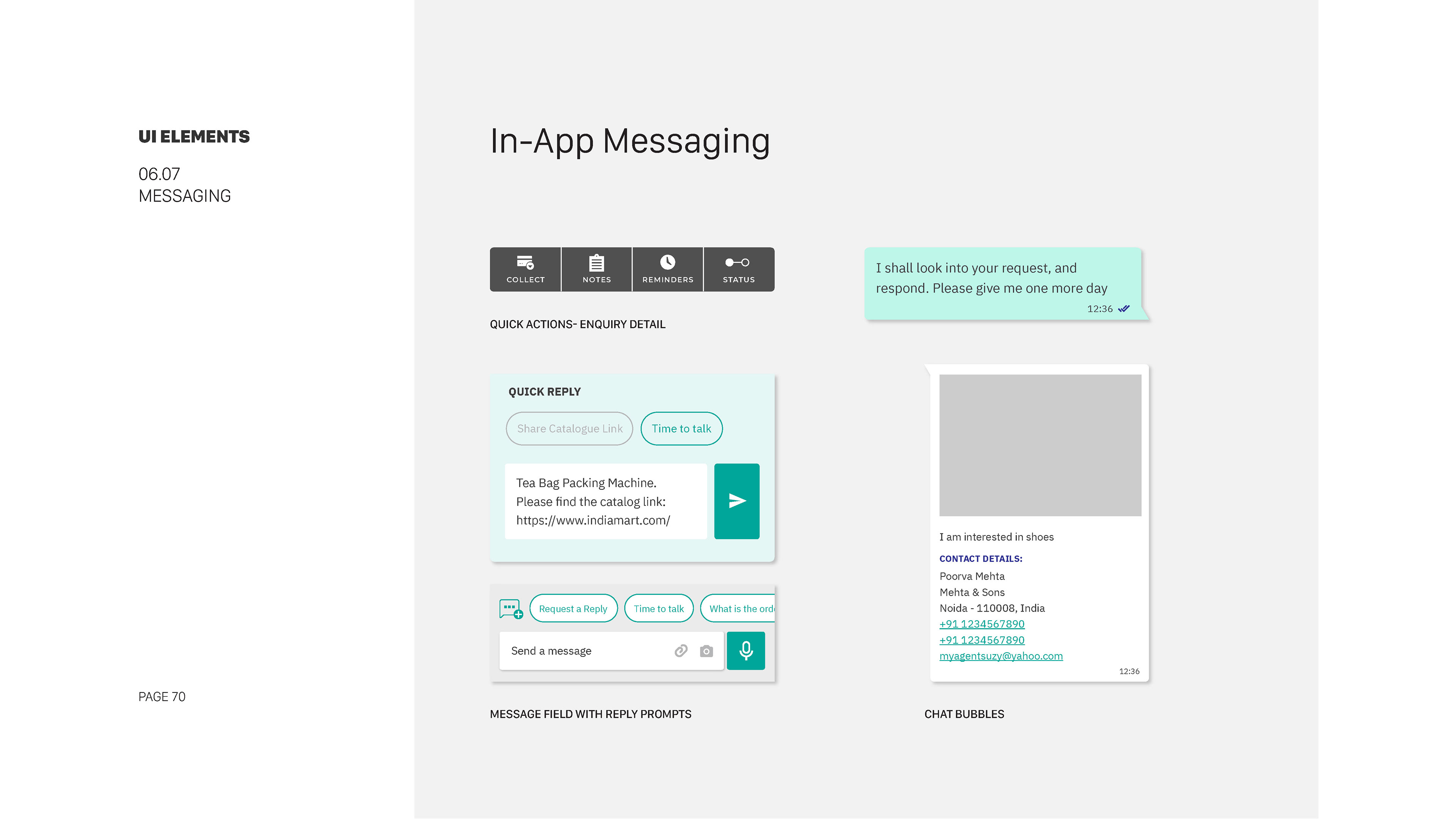
Created a consistent form style, featuring rounded text fields with subtle shadows for dimension.
Detailed error handling guidelines ensured clear user feedback during form submissions.
Days 36-40: Navigation and Menus
Detailed error handling guidelines ensured clear user feedback during form submissions.
Days 36-40: Navigation and Menus
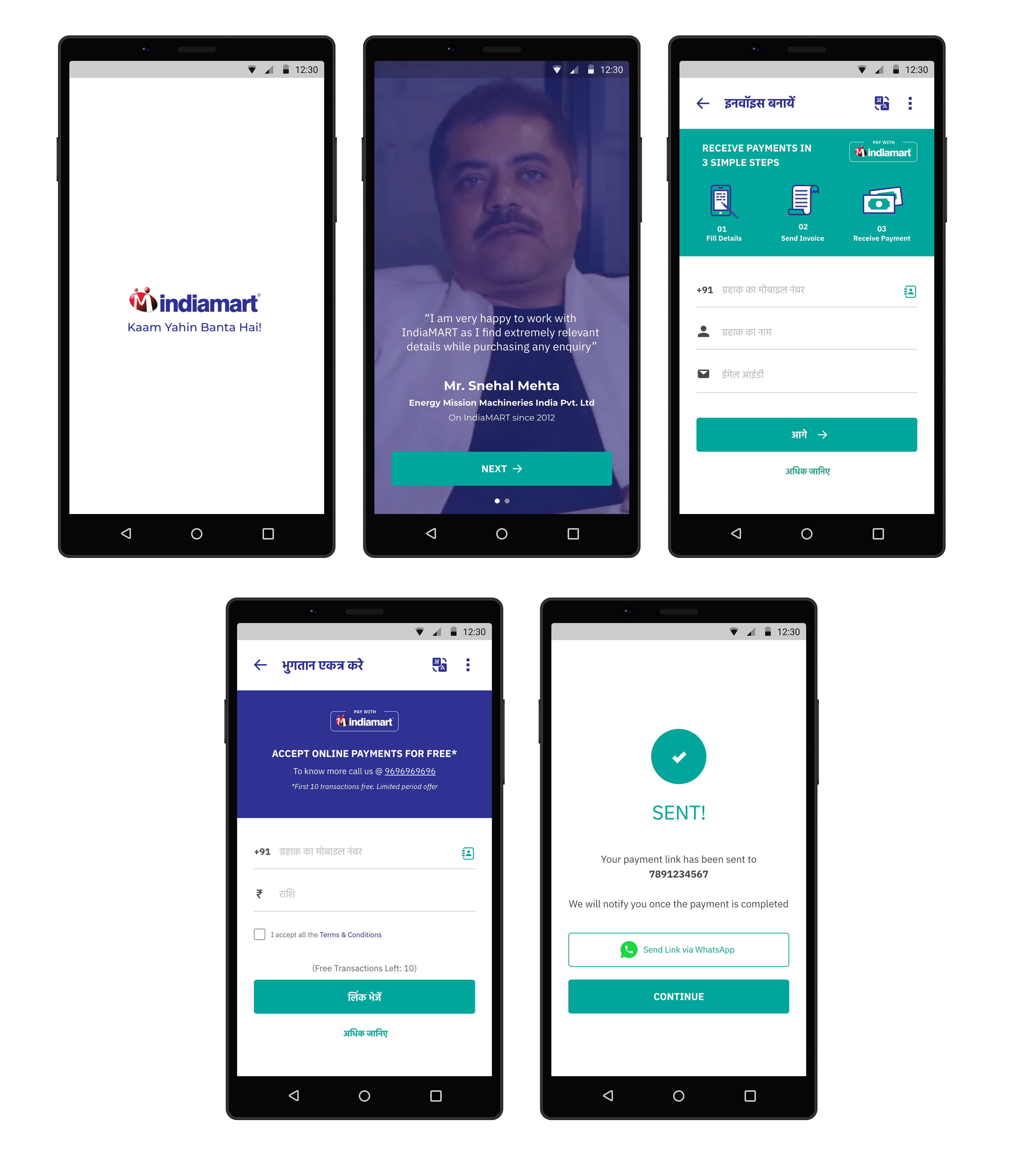
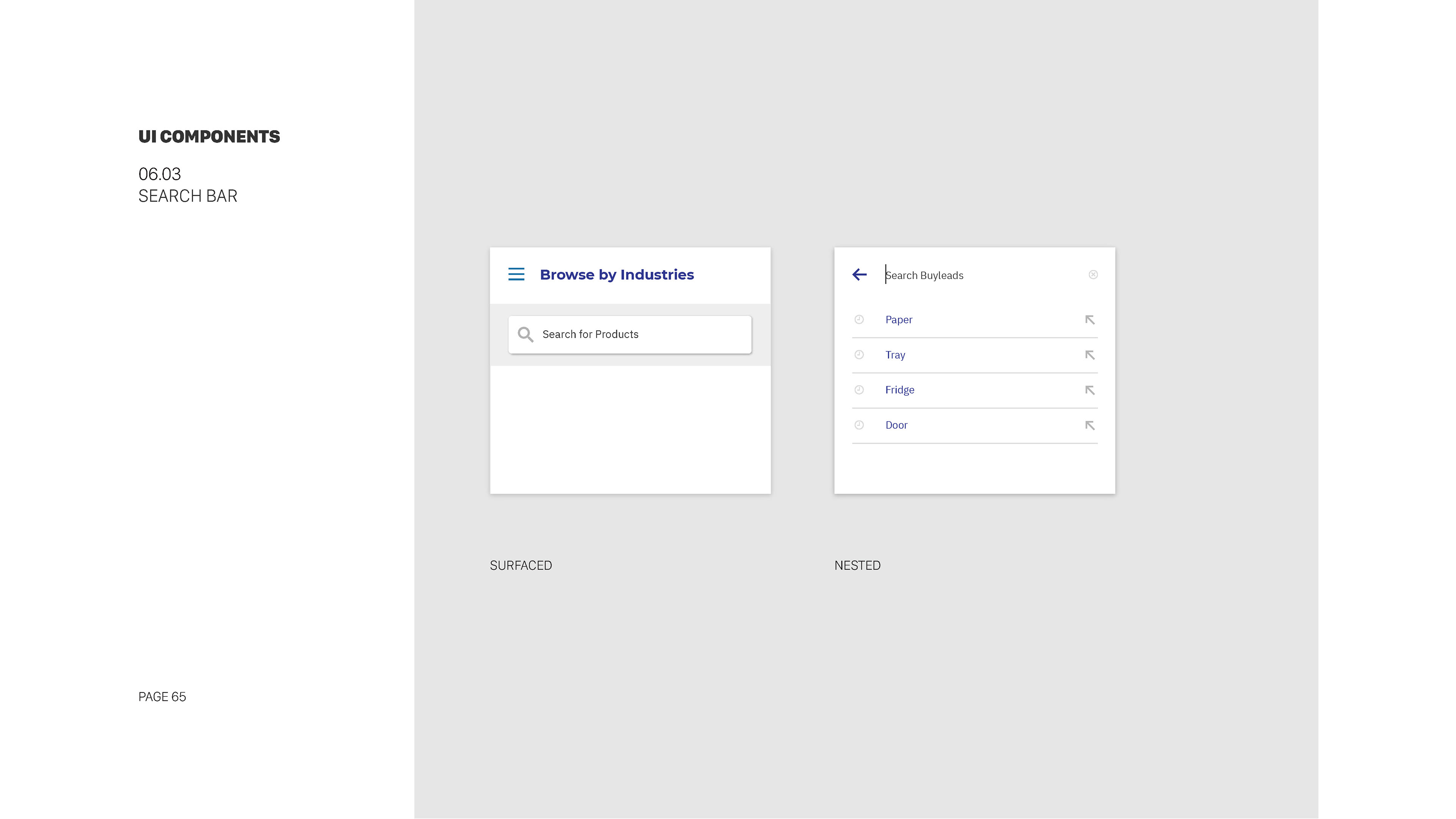
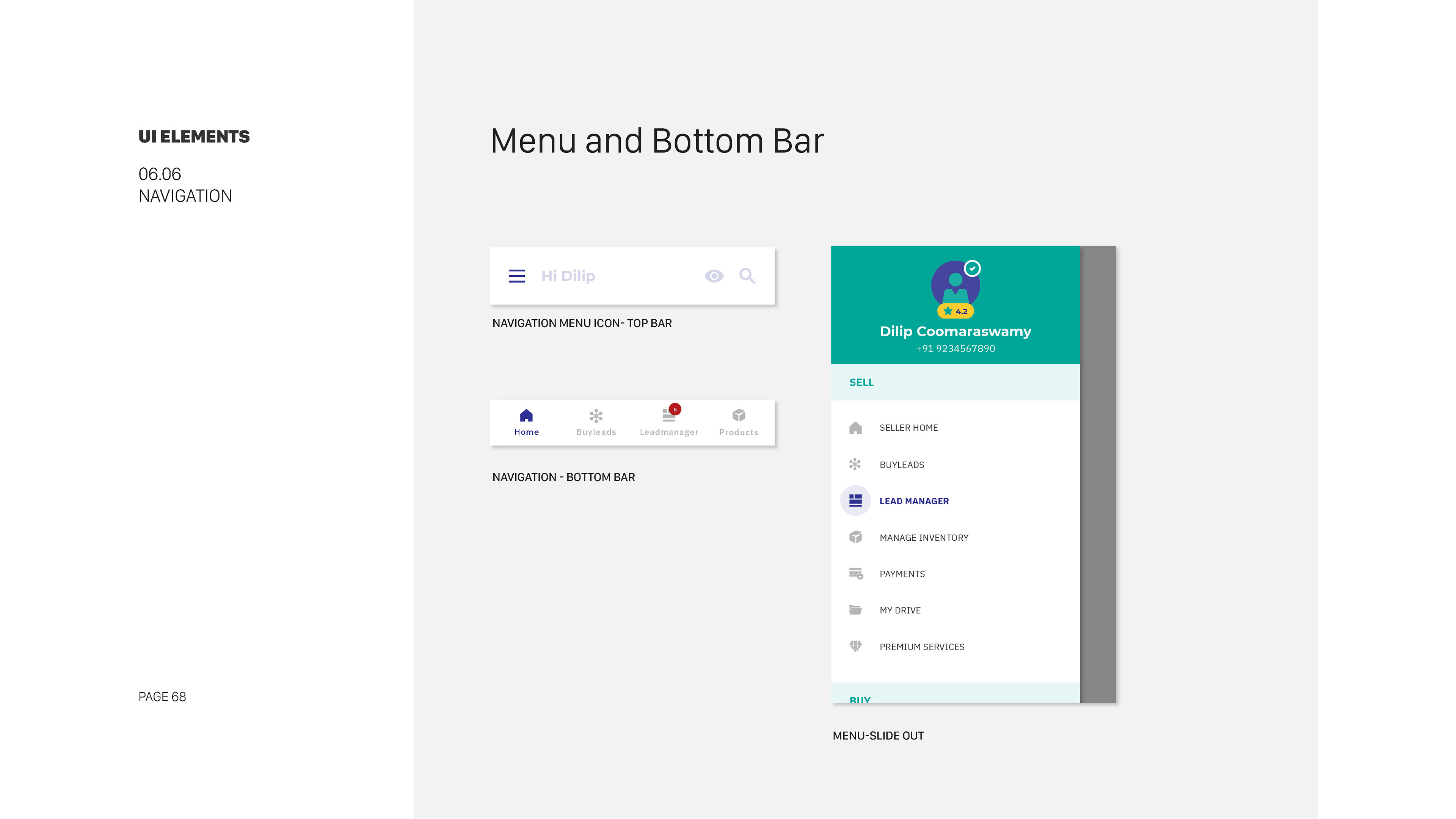
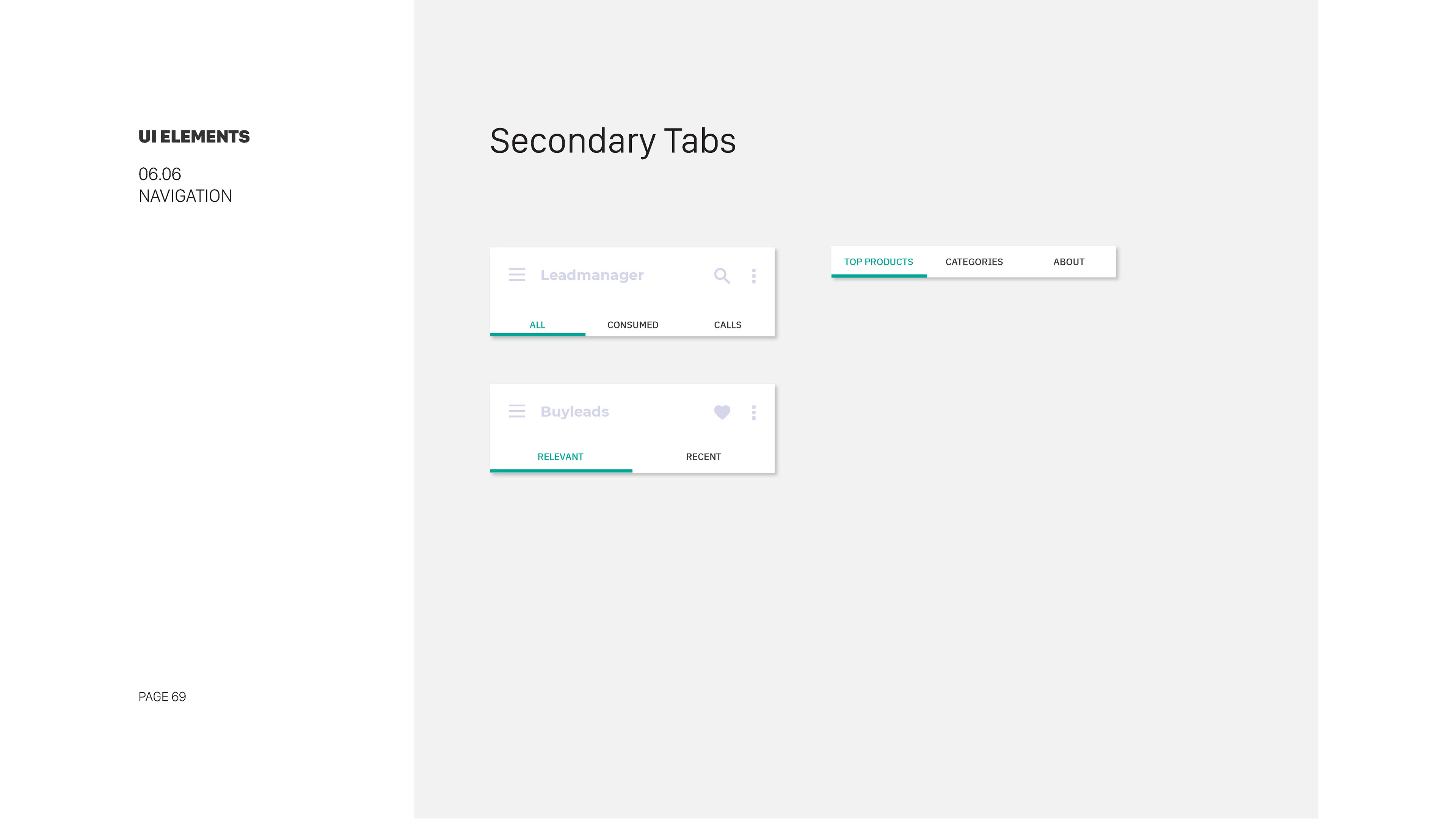
Designed a universal navigation menu with a collapsible sidebar for desktop and a bottom navigation bar for mobile.
Documented interaction behaviors, including smooth transitions and hover effects for menu items.
Days 41-45: Layout and Grid System
Documented interaction behaviors, including smooth transitions and hover effects for menu items.
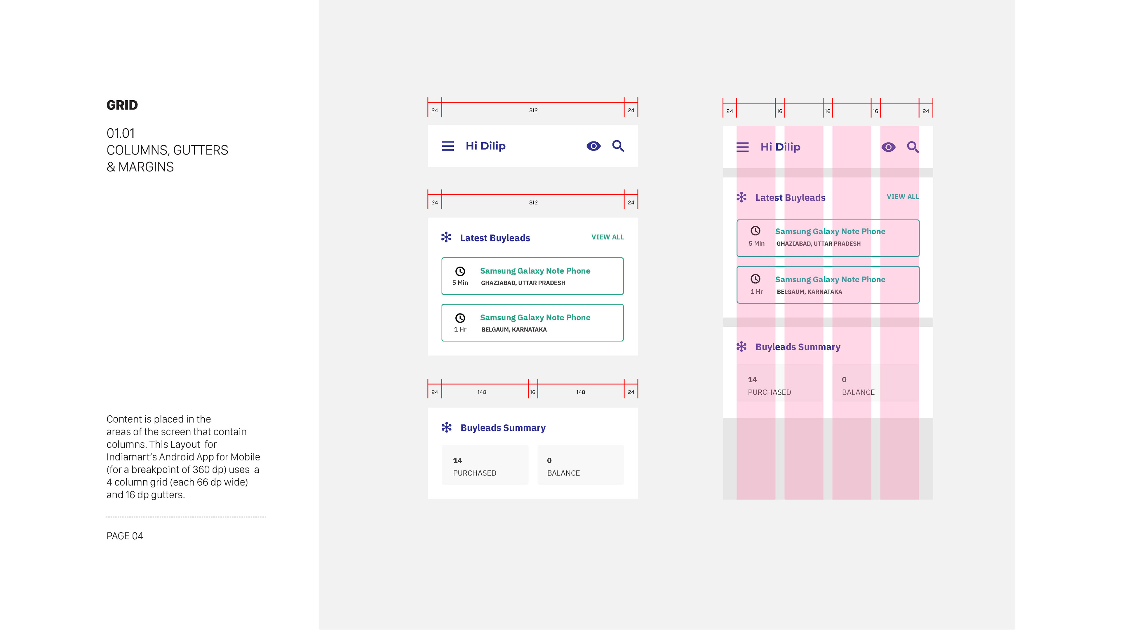
Days 41-45: Layout and Grid System
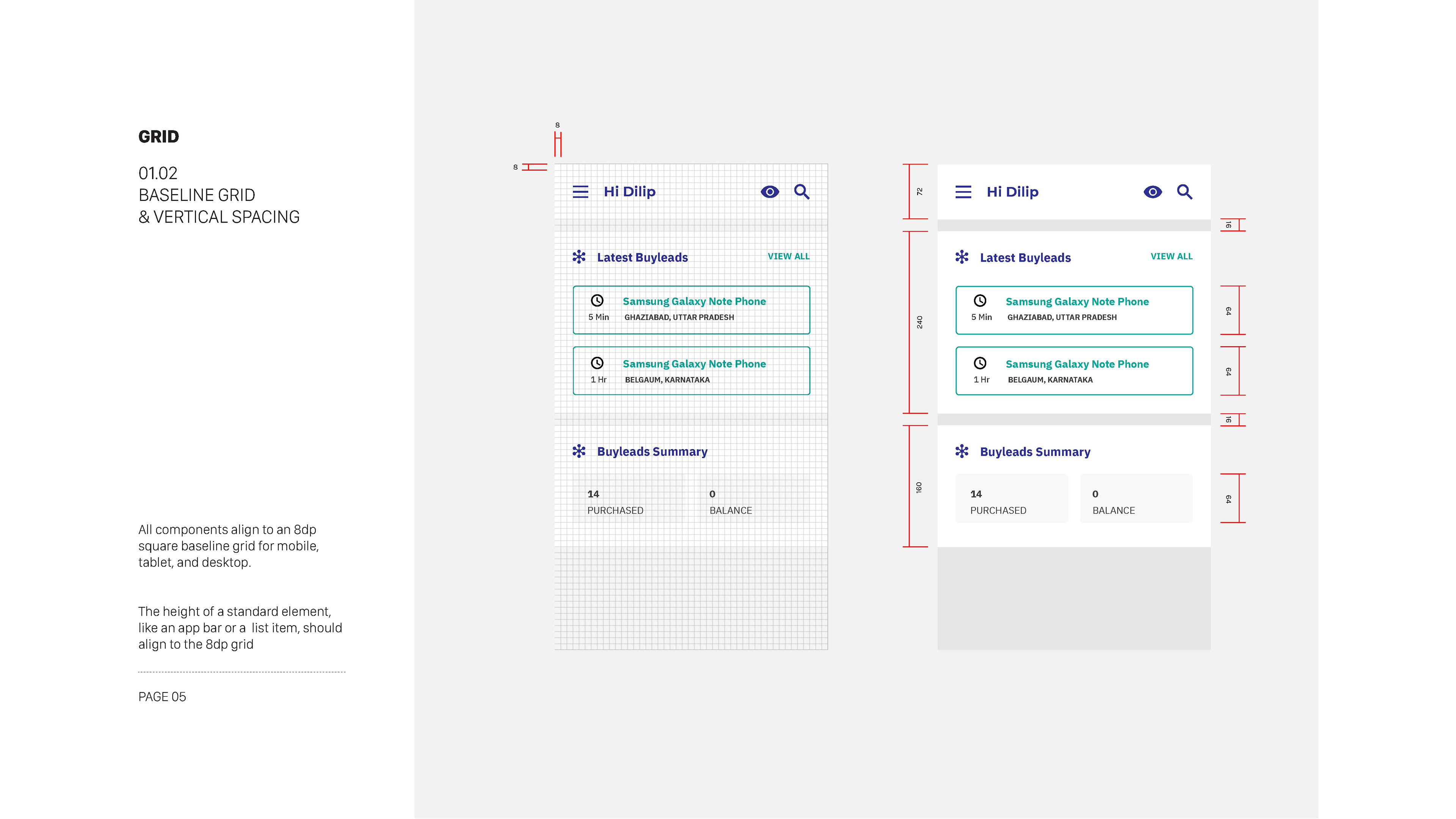
Implemented a responsive grid system with a 12-column layout for flexibility across devices.
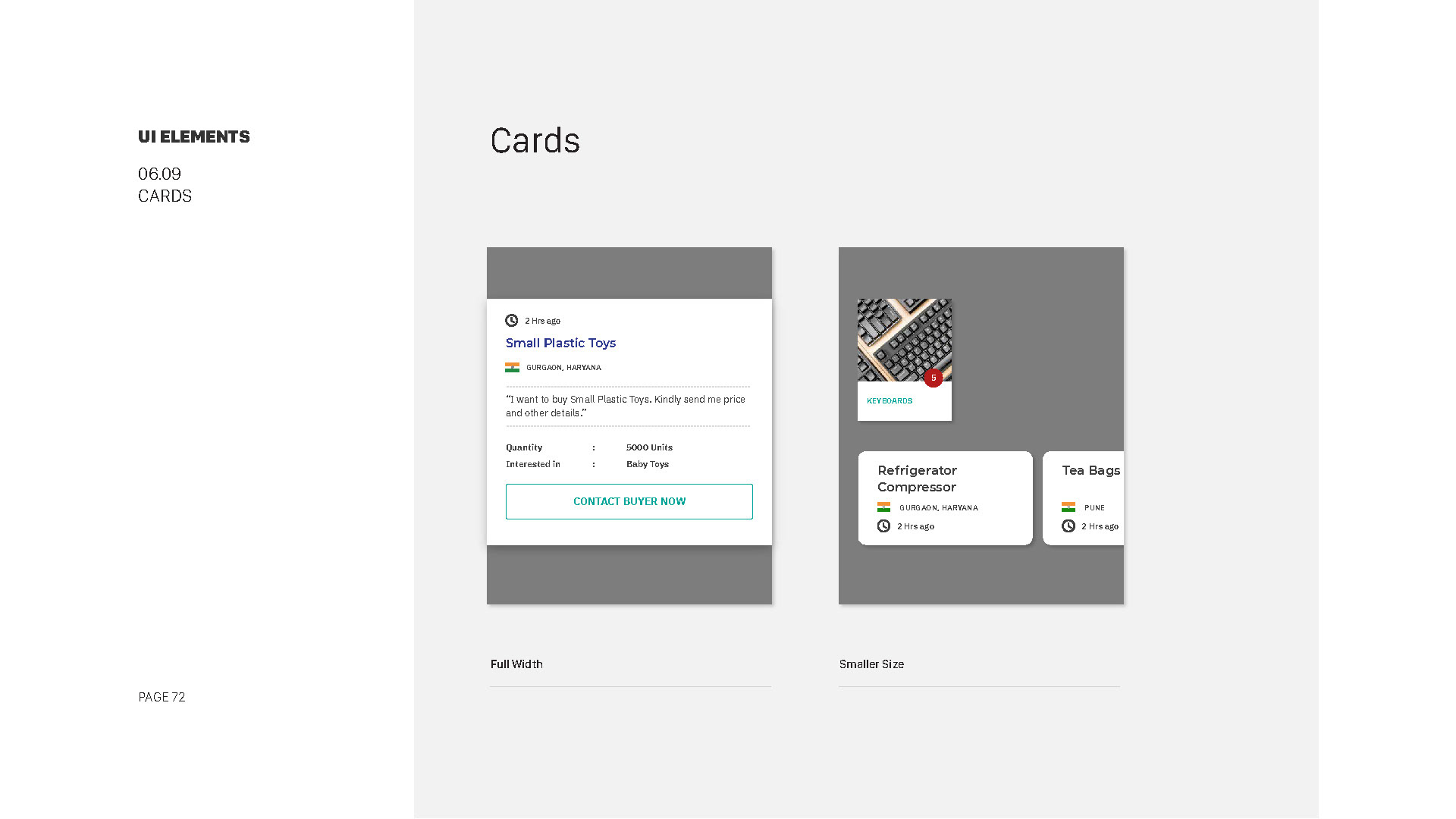
Guidelines documented the usage of layout options such as full-width, sidebar placement, and card-based layouts.
Days 46-50: Imagery and Media
Guidelines documented the usage of layout options such as full-width, sidebar placement, and card-based layouts.
Days 46-50: Imagery and Media
Guidelines outlined the use of high-quality imagery, specifying image size, resolution, and aspect ratios.
Recommendations included video integration techniques and the importance of using alt text for accessibility.
Days 51-55: Accessibility and Usability
Recommendations included video integration techniques and the importance of using alt text for accessibility.
Days 51-55: Accessibility and Usability
Ensured that the style guide adhered to WCAG 2.0 AA accessibility standards, including color contrast and keyboard navigation.
Documentation included usability considerations, like the use of micro-interactions for feedback and responsive design for mobile users.
Days 56-60: Documentation and Review
Documentation included usability considerations, like the use of micro-interactions for feedback and responsive design for mobile users.
Days 56-60: Documentation and Review
Compiled all design decisions, guidelines, and assets into a comprehensive style guide document, available in digital and printable formats.
The document underwent multiple rounds of internal reviews, including accessibility compliance checks and user experience audits, to ensure completeness and cohesiveness.
The document underwent multiple rounds of internal reviews, including accessibility compliance checks and user experience audits, to ensure completeness and cohesiveness.